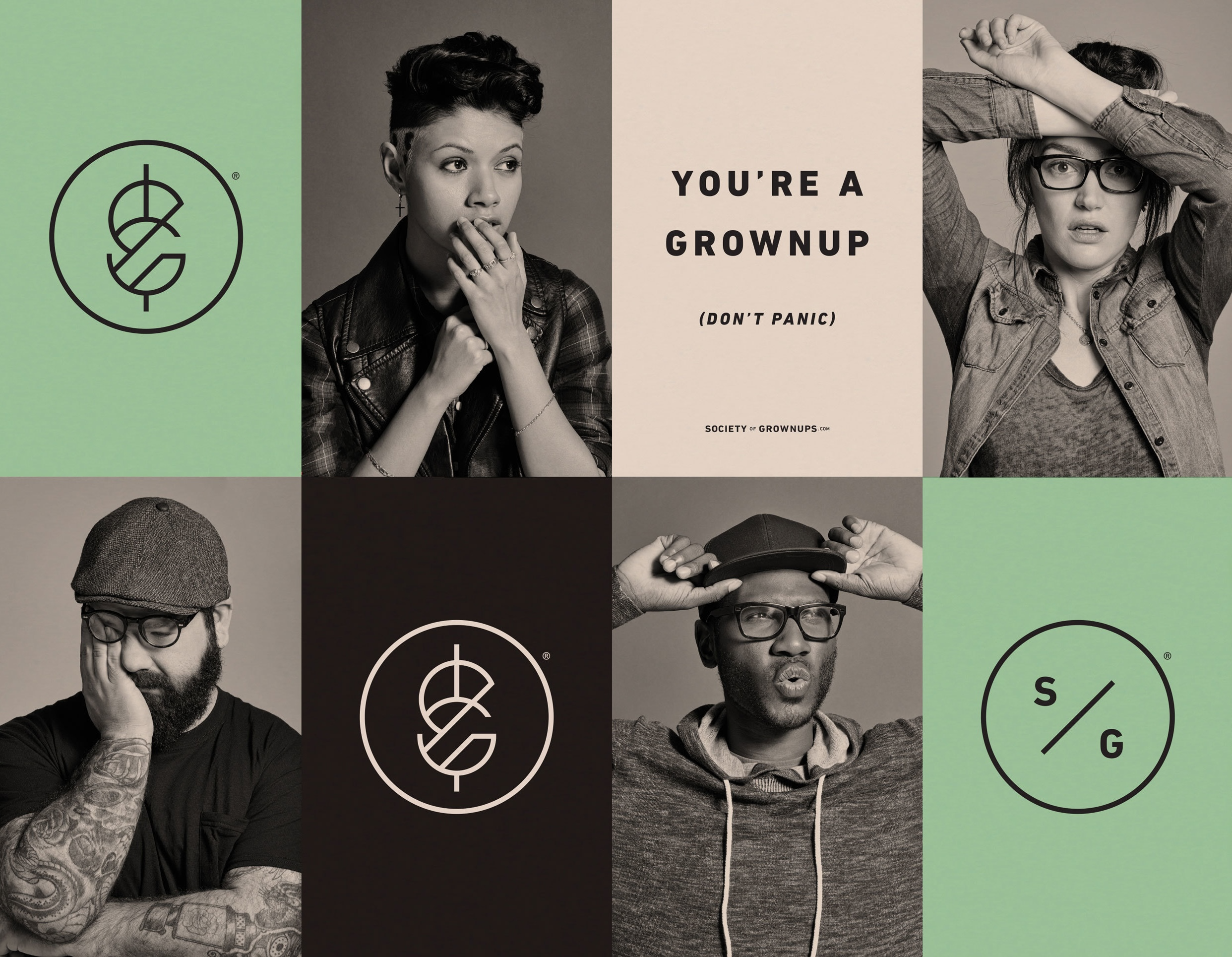
Democratizing Financial Literacy
The Project
The Society of Grownups operated as a physical location in Cambridge, Massachusetts, offering group personal finance classes and individual sessions with a Certified Financial Planner. To expand it’s reach, this project focused on transitioning this experience into a digital product. Users (Grownups) are overwhelmed by the education and advice they receive around their personal finances and don’t know how to make it actionable during major life transitions. In addition to democratizing financial literacy, this digital shift would also provide access to new revenue streams, including partnerships, paid advice, and white-labeling opportunities.
To measure success, in the prototyping phase, we were most interested in emotional response and desirability as an early indication of product-market fit. Upon launch, we would look at sessions per user, monthly active users, and task completion as indications of engagement and the ability to monetize.
Company: Society of Grownups • Role: Lead UX Design • Medium: Mobile
Foundational Research
To ground our research, I designed a program consisting of:
• 1-1 interviews with existing customers
• A review and analysis of Financial session data (income, debt, etc.)
• Compiled market research
• Competitive analysis
From this initial research, the major pain points that arose were:
• Personal finance is scary
• Triaging information amongst many sources is natural
• Users feel conflicting information is abundant, and there is no one true source to rely on
• Current personal finance apps specialize in one area (i.e., mortgage, investment); there isn’t a full picture of users full financial health picture
• Income to debt is a huge limitation
• Most users were struggling with the decision to optimize for now vs save for the future, and were not able to do both
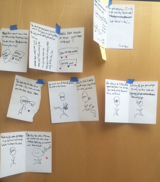
Conceptailizing
The core issue our foundation research revealed was that financial illiteracy was the root of all financial issues. We decided to begin there. Much like our CPA’s were doing in real life, our digital concepts would weave education and advice so that complex financial concepts became more digestible. Monetization moments would come at a later phase as we started to understand what products could be or services to users, and only after building rapport.
Goal: Prototype three divergent ideas, providing users with a plan to increase financial literacy and take action on their finances.
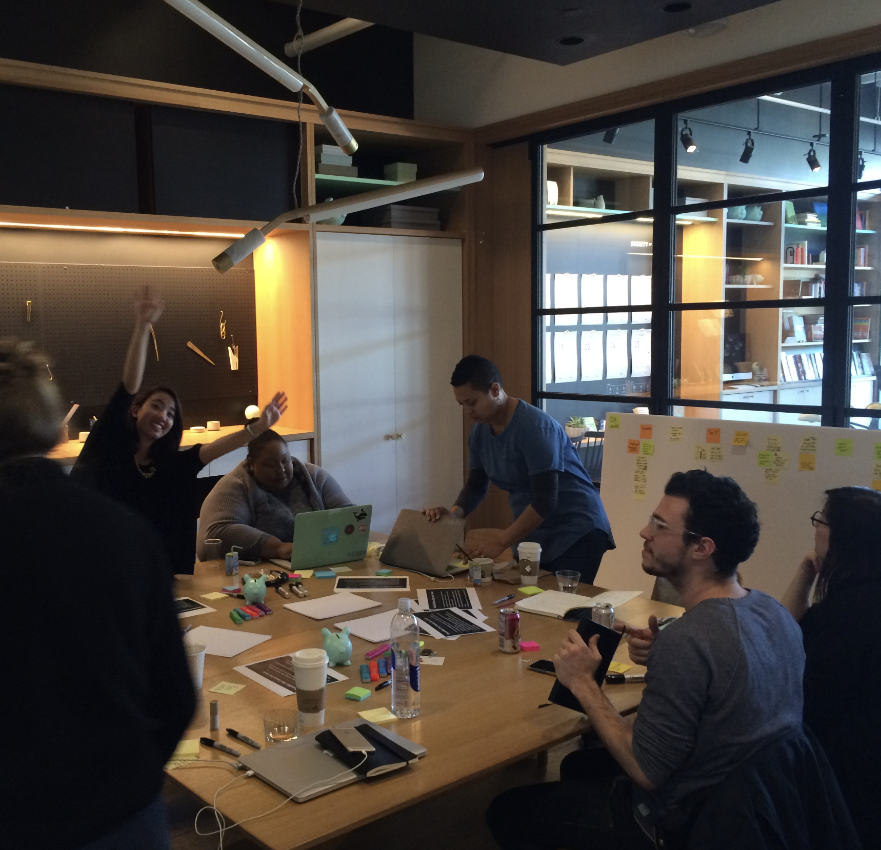
I helped to organize our Design, Research, Customer Service, and CPA teams into a Design Sprint where research insights were shared to feed structured brainstorming and ideation sessions. Eventually, we wanted to learn from our resulting concepts:
• What elements resonated the best?
• What’s missing?
• Did users understand the concept, and could they see potential value?
• What method of delivery worked the best & why?1. Core search: Part of the user’s current situation and likely won’t change during the course of the search; a summary
Final Concepts
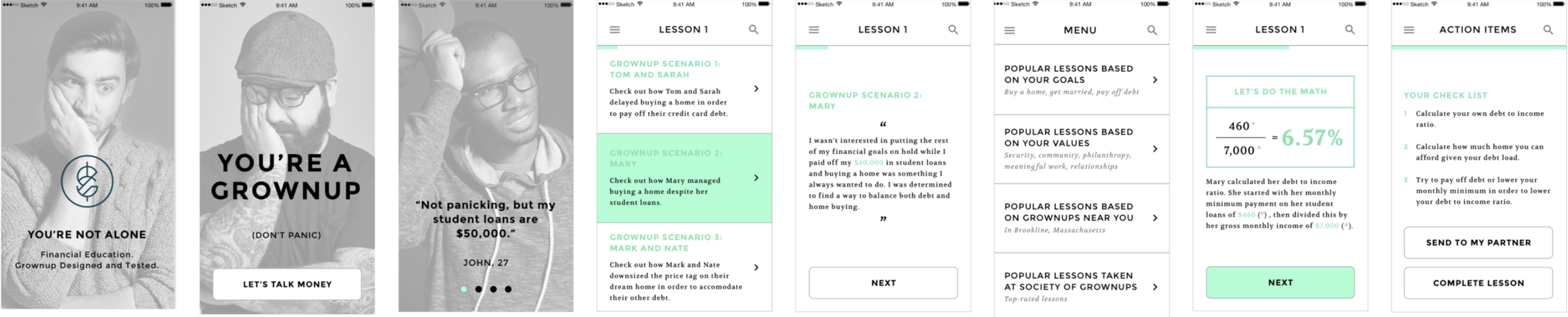
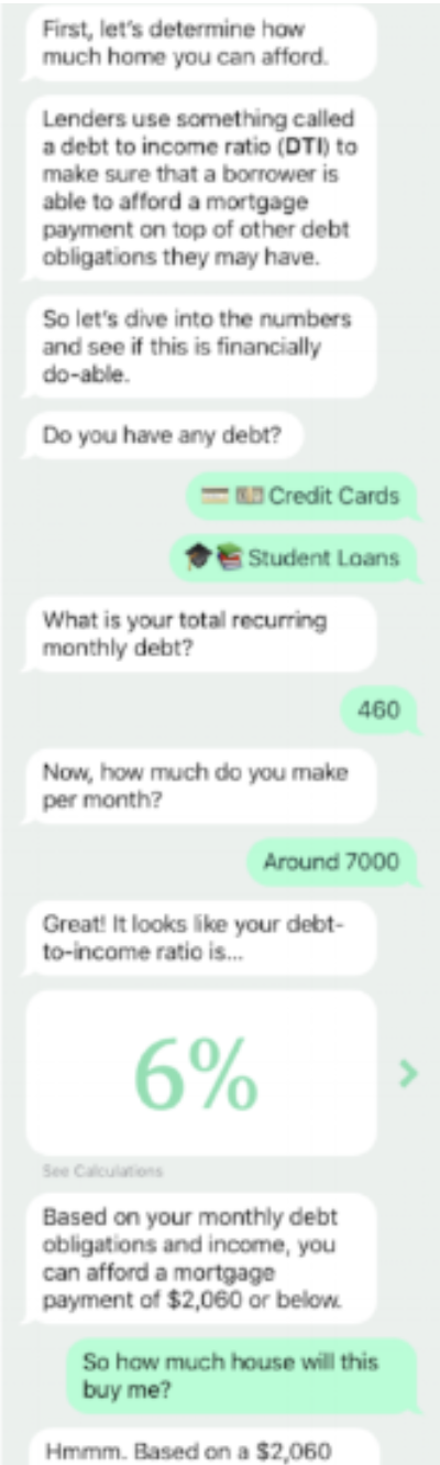
Concept 3: Conversational
Our third concept leveraged a more conversational and perceived personalization feeling that users experience in real-life sessions with a CPA.
Concept 1: The Mascot
Using our research insight, we knew users’ primary emotions were stress and overwhelm when approaching personal finance decisions. In this concept, we wanted to play to those emotions by offering support and cheerleading to curb anxious feelings and help the product feel friendly & approachable.
Concept 2: Case Studies
The page header echoes the core search and displays the main filters. When the user wants to see more filters, the page header expands down, pushing down the table.
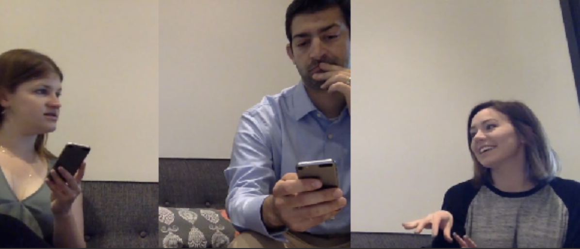
User Feedback
I designed and conducted the testing protocol and interviews. Each concept was tested with six users—3 existing customers and 3 non-customers. The high-level findings were:
• The Mascot (concept 1) works in the beginning and tends to fall off over time, seeming condescending or “too youthful”.
• The Quizzes feature helps break up the “work” and gives a sense of accomplishment
• Values check-ins are essential in providing a sense of calm and accomplishment
• The idea of seeing “what the Joness are doing” via case studies in concept 2 was highly valuable
• Users find it very important to see their own data reflected rather than staged example data
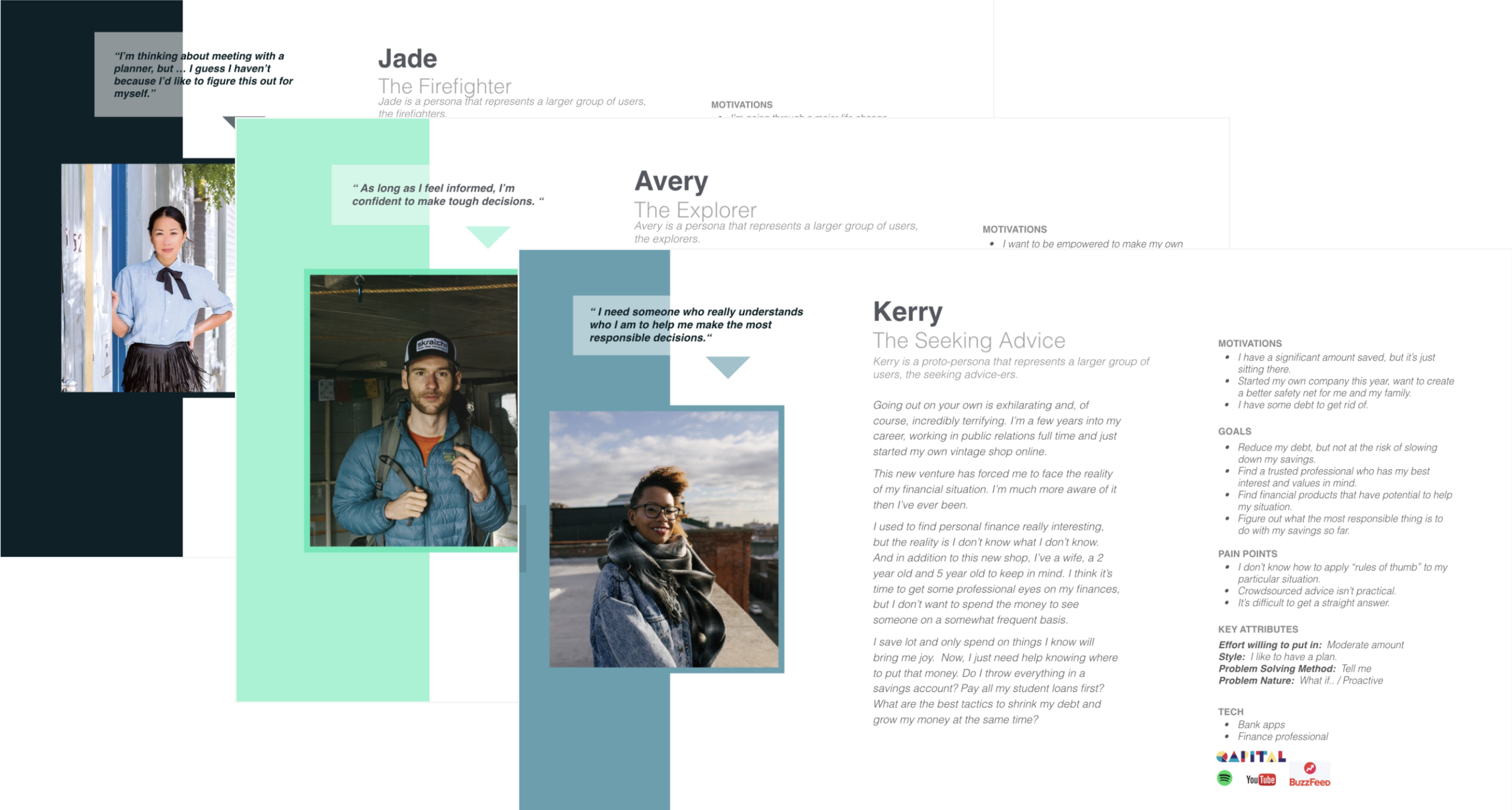
Persona Development
After collecting insights from testing with users, I analyzed and consolidated user behavior and perspective into three major personas to aid the design, development, and marketing teams in future product development.
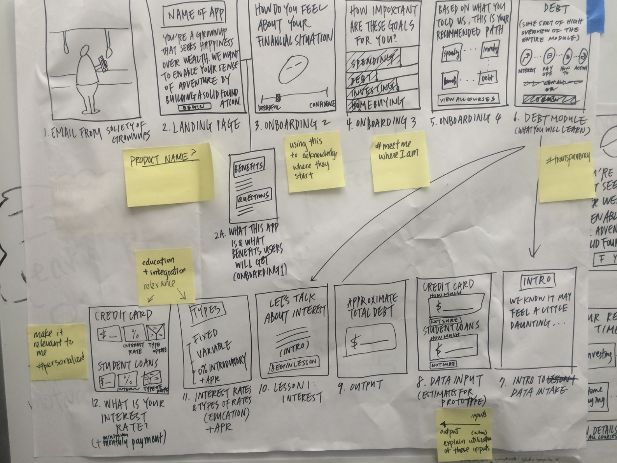
Product Development
Following the concept refinement and user testing phases, we have finalized our direction and commenced development.
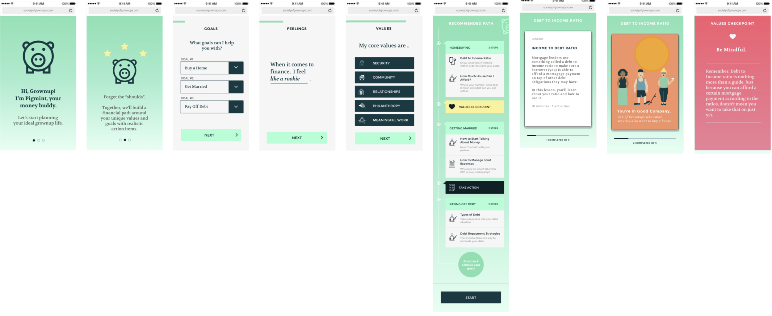
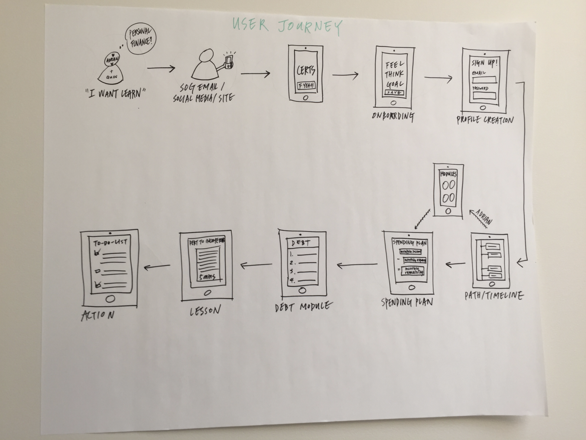
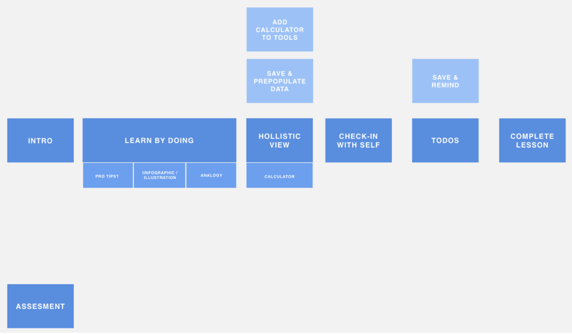
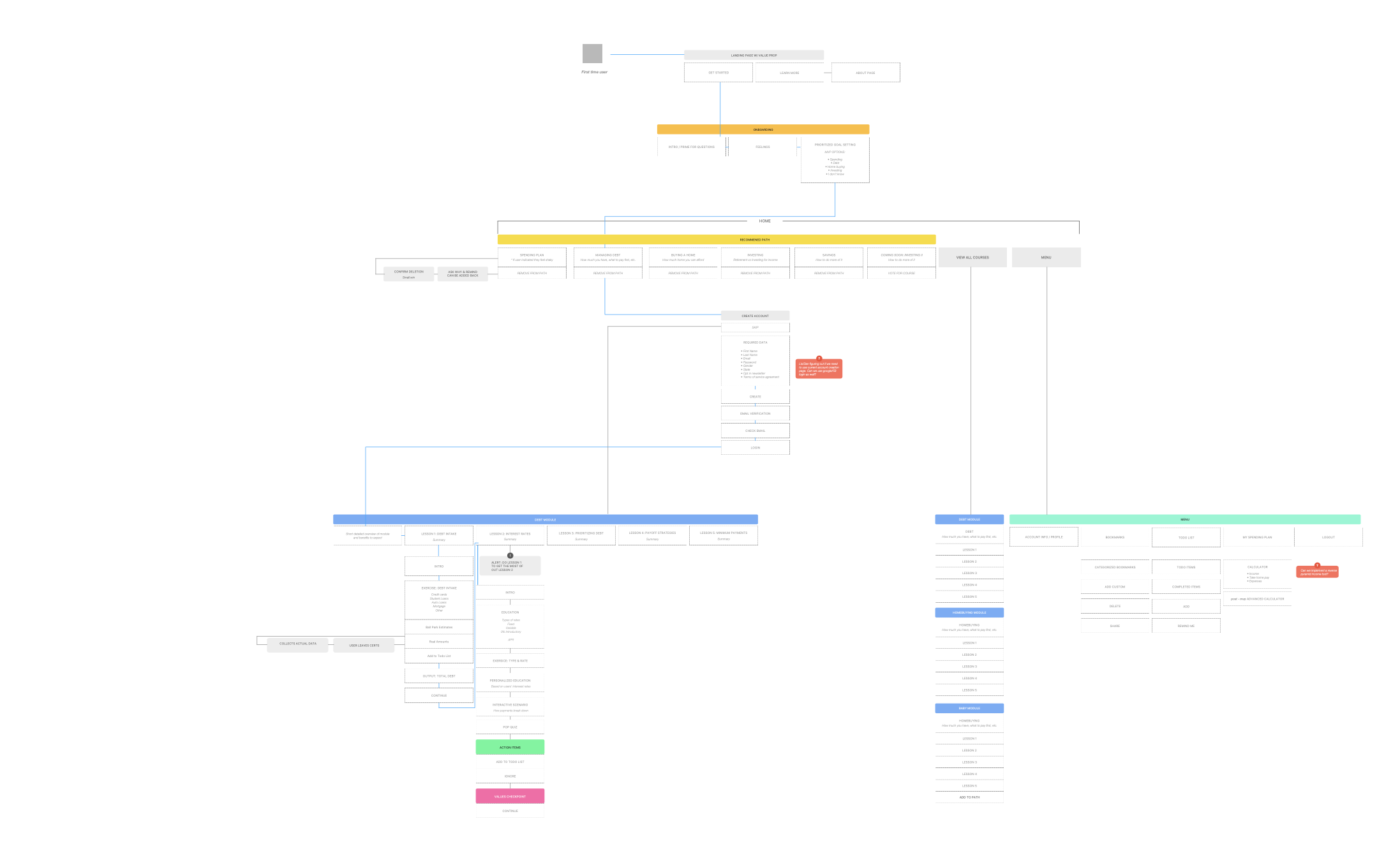
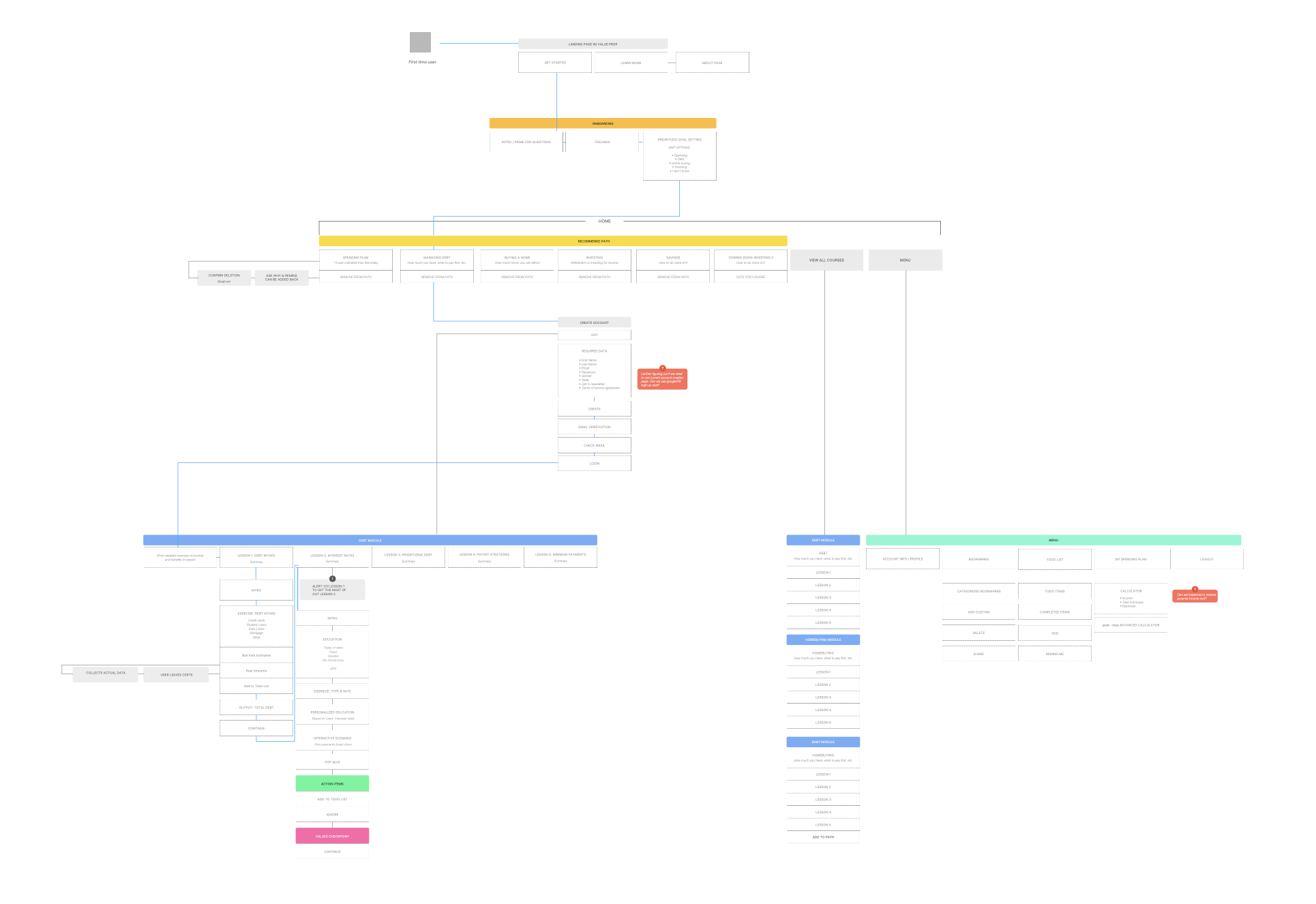
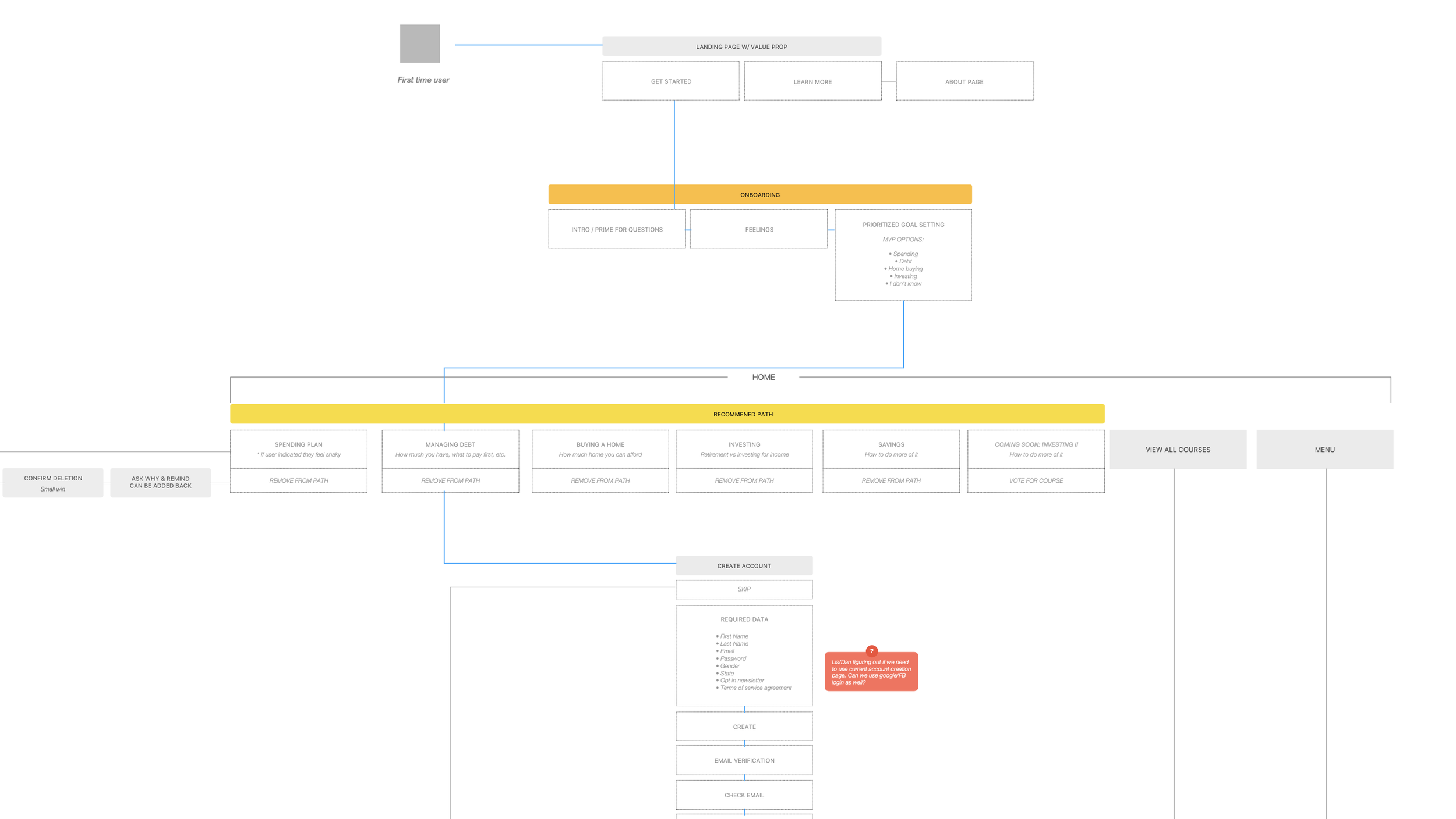
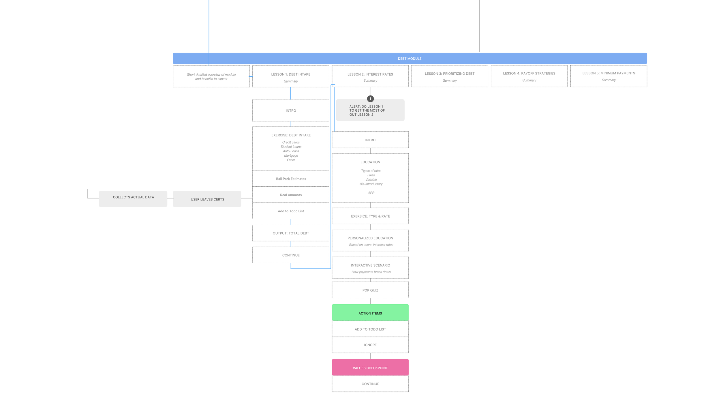
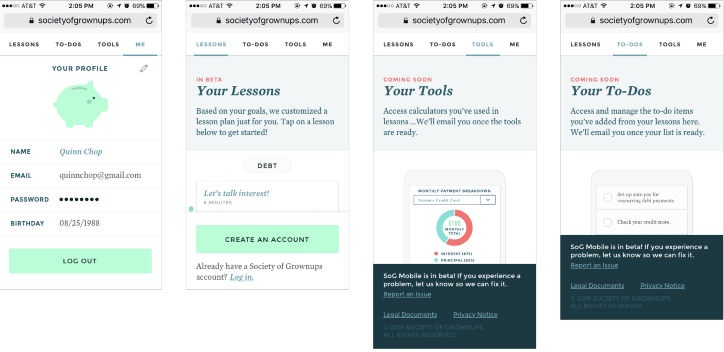
In this stage, I focused on defining workflows, modules, and educational frameworks. I also built the architecture and interaction between the app's major verticals—including lessons, profiles, dashboards, onboarding, and tools—to ensure we are working effectively with our development and product teams.
At the same time, visual design was laid out and polished in tandem with groundwork development.
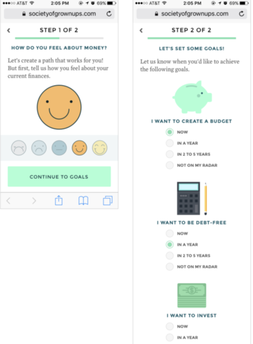
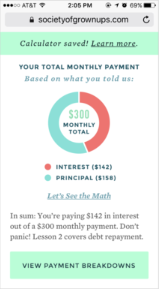
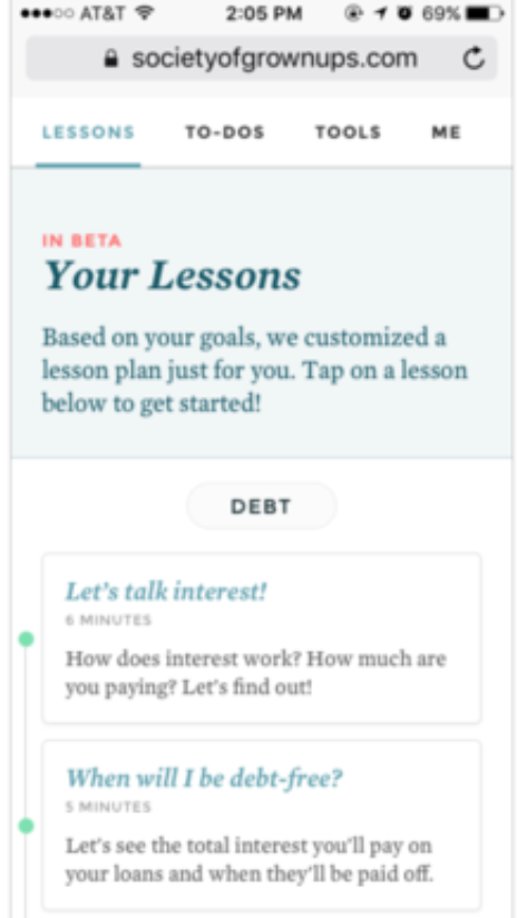
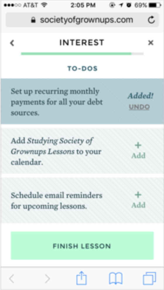
Beta Tested Key Features
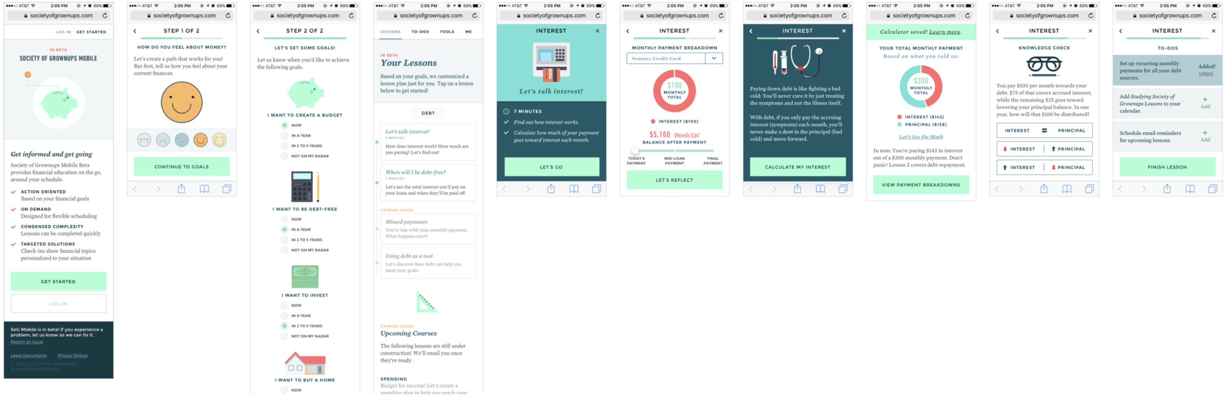
Customized on-boarding
Learn by doing w/ real user data
Custom lesson plan
Quizzes to reinforce concepts
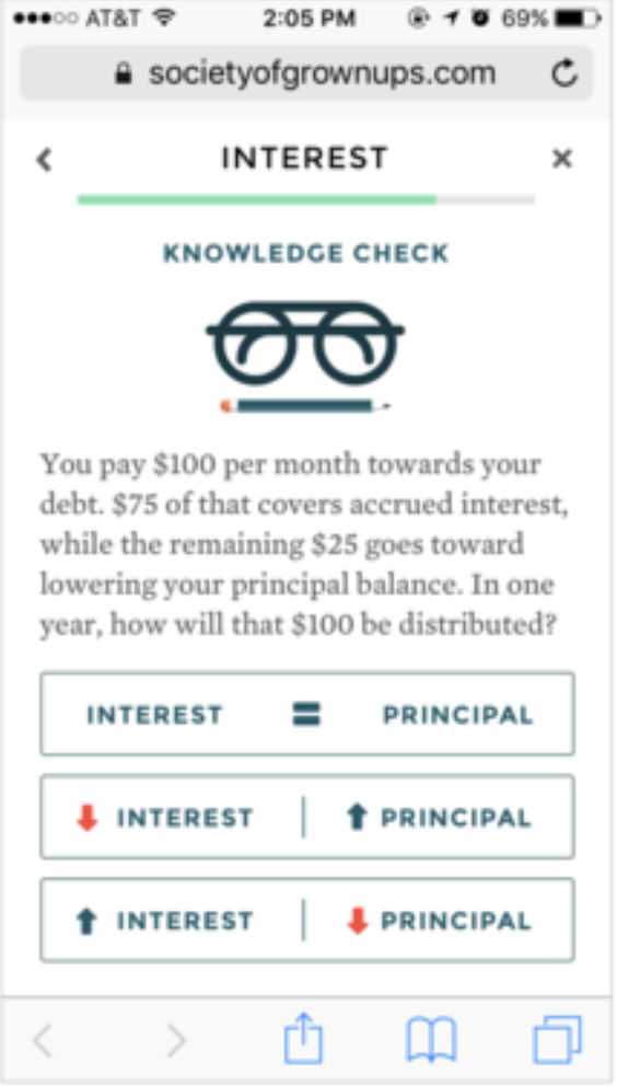
Action-oriented learning
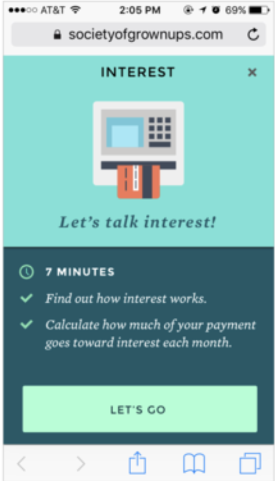
Attainable action items
Final Designs
Results
Teams
As the product started to shape out, we saw a natural focus for teams to develop around the core elements of lessons, profile, design system, and tools. Product owners were deployed across these areas.
Beta Program
We completed a three-week beta testing cohort consisting of 50 existing and new members. Throughout the process, we conducted weekly check-ins via Typeform surveys and collected additional feedback through email. The initial feedback was largely positive.
A Unforseen Shift
Our parent company, MassMutual, was experiencing a downturn in profitability in other sectors of its business towards the end of this project. Eventually, they decided to reduce funding to new ventures, like ours, only keeping the content arm and a few classes running at Society of Grownups. Eventually, they closed down the space and de-prioritized this project entirely, and our team was unable to see the long-term future of our product.