Reducing waste, time, and cost of large-scale construction projects by improving functionality & communication in the documentation system
The Problem
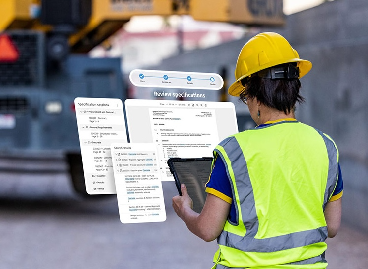
Autodesk’s construction management tool, BIM360, promised end-to-end project handling. All the features were there, but the heart of the operation, the document library, was unable to perform the tasks its complex user base required. As a result, BIM 360 users were creating their own libraries or leaving BIM 360 altogether, favoring nimbler competitor solutions, in order to reduce cost, waste, and time on-site. In order to improve customer retention and acquisition, the product team needed to improve communication, maintainability, and consistency on large-scale construction projects by improving the reliability and functionality of the document management library.
Company: Autodesk • Role: UX Design & Research • Medium: iPad & Desktop
Foundational Research
Broken heuristics
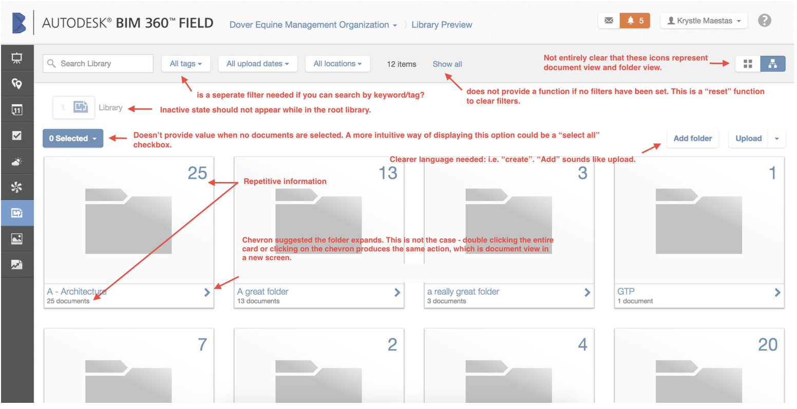
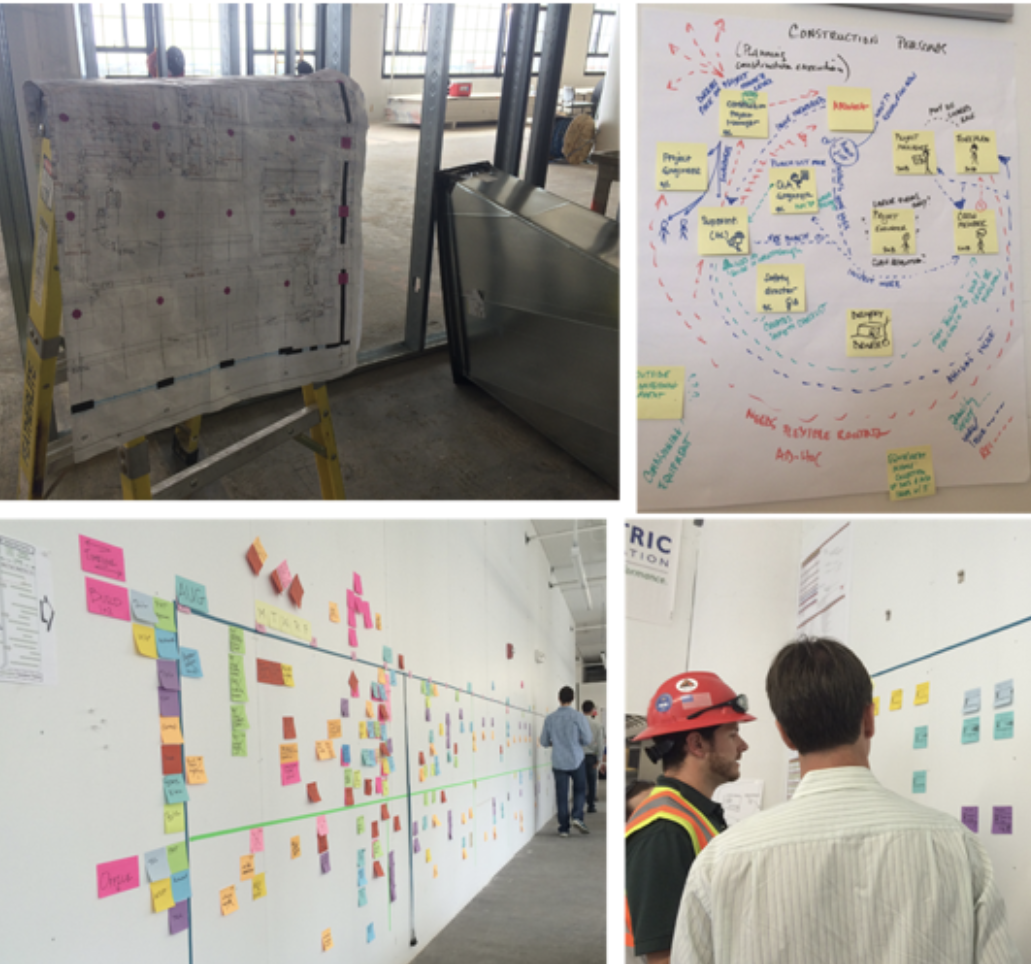
To identify the low-hanging fruit that our development team could get started on right away while I conducted a heavier research initiative, I completed a Heuristic Evaluation of the existing product to identify major UI/UX incapacities. I also conducted a workshop with the Document Library team (engineers, product manager, product director, design manager) to identify other areas of growth within the product, our “known knowns”. In this stage of discovery, we discovered many instances of repetitive information, confusing iconography, a decentralized filter system, confusing active/inactive UI states, lost archival markups, missing important metadata on documents, such as the owner of the document, and missing zoom controls.
2. Fast-paced build environment with constant build changes
After identifying existing technical/design snags in the application, the team set out to identify customer pain points. I used observational research methods, such as “fly-on-the-wall,” to gather insights into the natural workflow and communication networks on live construction sites. I held 1-1 interviews with various users of the product (Architects, Construction Managers, Civil Engineers) using Motivational Interviewing and task-based protocols to learn more about their experience in the existing application.
Alongside on-site user research, I looked at competitor products to see what problems they were solving for our users.
Findings at this stage included:
Many users are trying to access new drawings (documents) at the same time, and are uncertain if they are building to the latest and greatest architectural/construction drawing
Limited/slow wifi access on-site, in turn, slow renderings of big files when a “quick view” would suffice
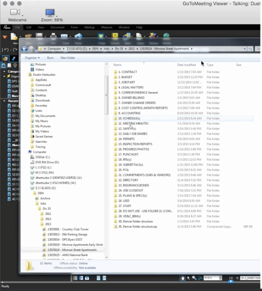
Document versions with slight deviations in file name get uploaded as a brand new document rather than a new version of an existing document
Difficult to quickly compare a previous version to a current version of a drawing to identify change orders
Overall low confidence in building and increased time, material waste, and cost on-site.
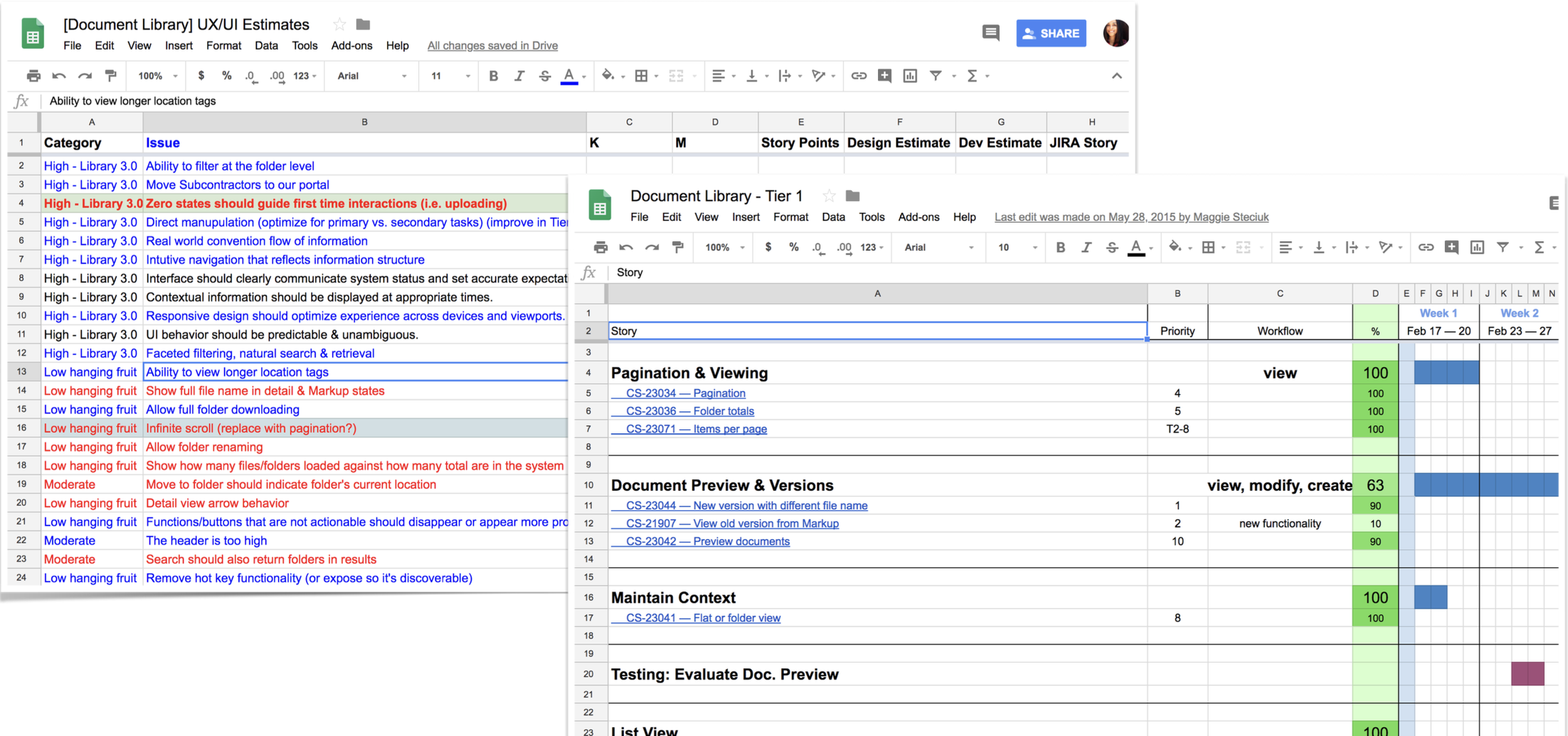
Feature Estimation & Planning
With a thorough analysis of our heuristics study, user research, and competitive research completed, the design team identified key areas of improvement and facilitated an estimation workshop with cross-functional team members to identify our MVP, feed our longer-term roadmap, provide bullet points for our Sales and Marketing teams, and build team alignment.
Putting it all together
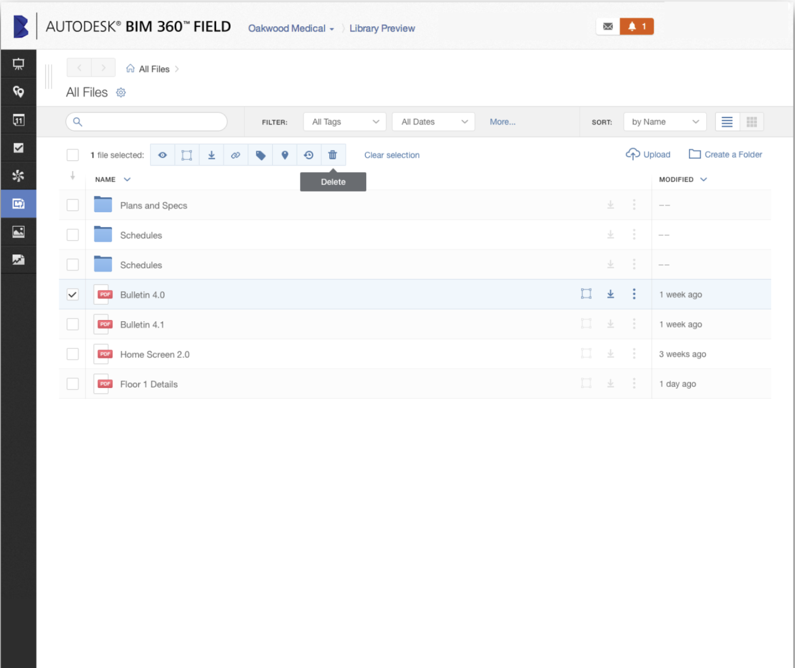
List view
Quick access to a drawing; no more waiting for a large library of thumbnails to download on-site on a slow network
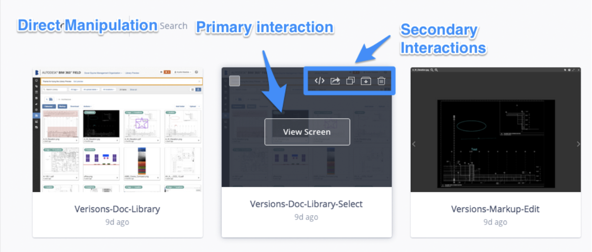
Direct manipulation of large files
Quick reference to dates increases confidence in the accuracy of information
Multiple file manipulation to save admin time
Ability to view entire file names, reducing cognitive load and time to open a file
Quick reference of metadata, such as who the author of the drawing was, allows users to quickly identify and contact the correct trade if they have questions while in the building stage.
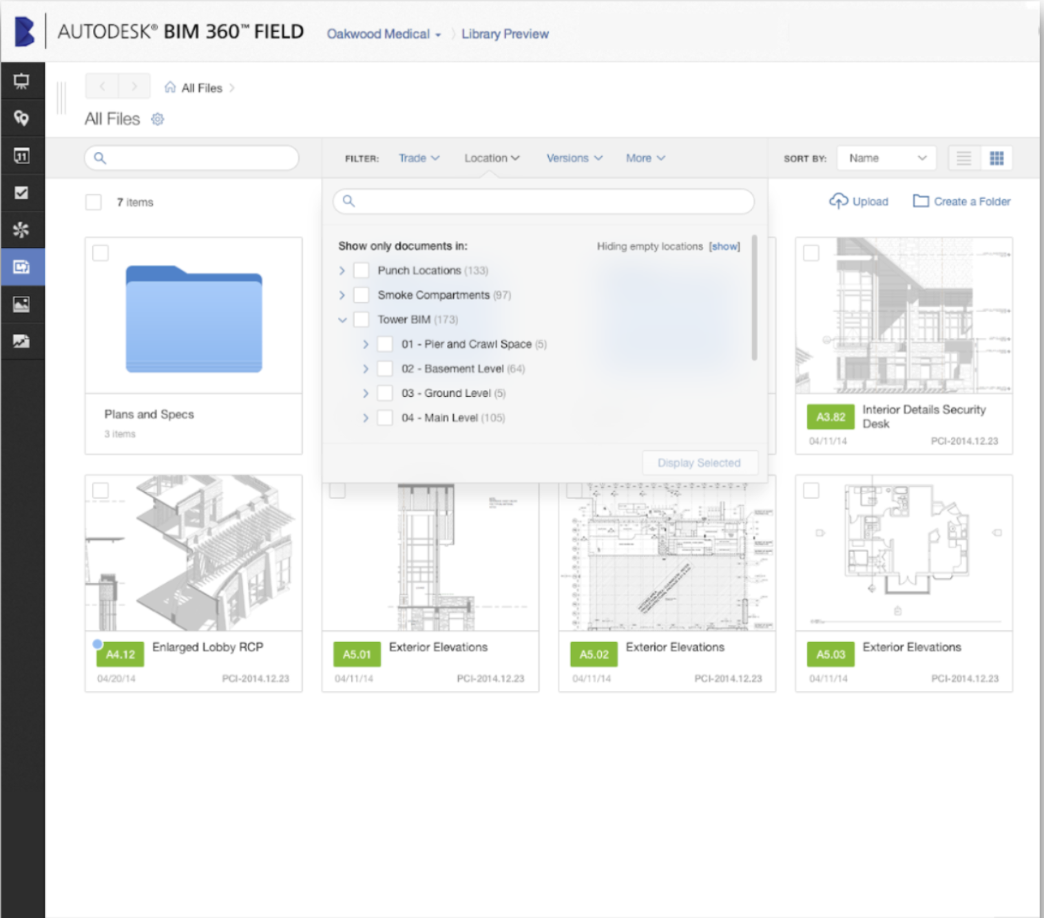
2. Centralized filters
Filter in one place rather than increasing cognitive load by searching for filters in multiple locations
Ability to see only what matters to each trade
Quick retrieval of documents on-site (i.e. Foreman in the 62nd floor bathroom can see plans he is currently working on)
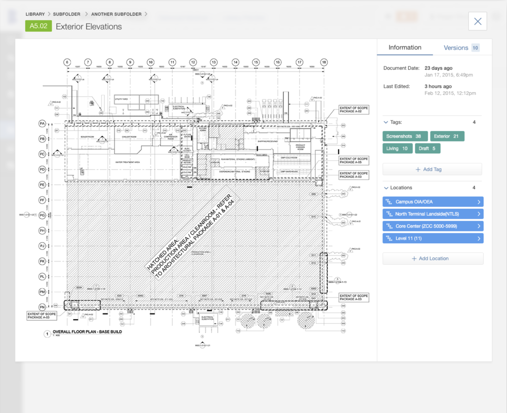
3. Preview/Quick-shop
An additional feature that solves for slow networks and provides quick access to information. This “quick view” allowed users to identify their area of work, zoom, and see details related to their trade only, resulting in a reduction in waste by doing the right job once rather than building to an incorrect plan and redoing the work the next day.
Ability to add document details from this screen
Powerful usability for “view only” workflows, such as a complementary trade or permit administrator
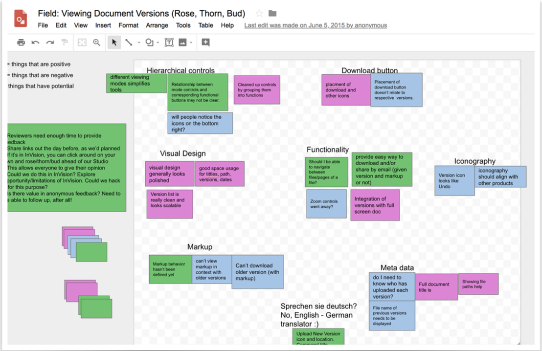
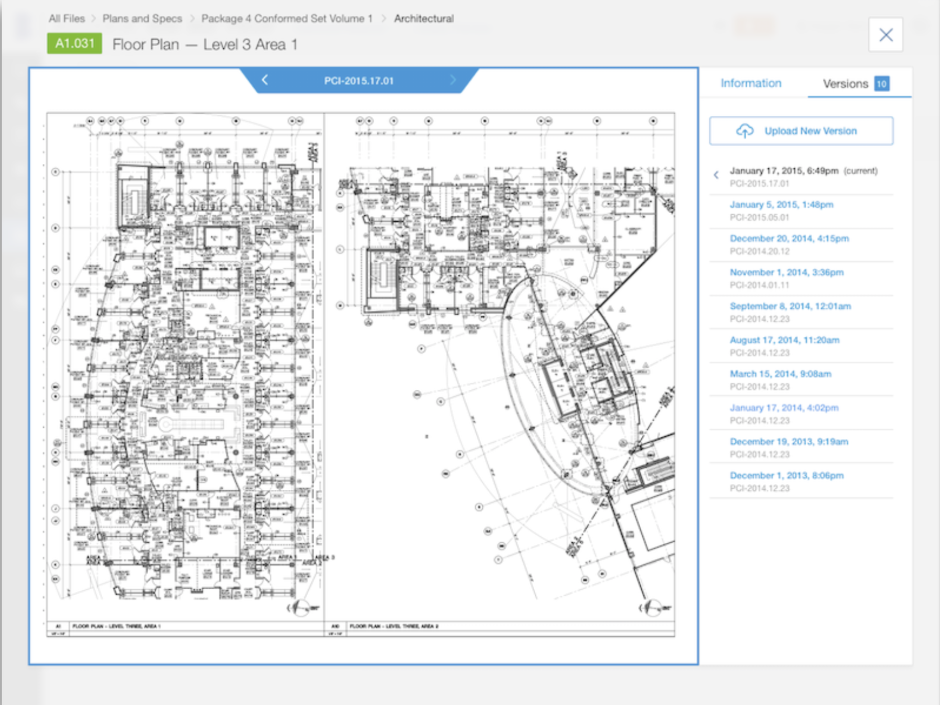
4. Versions
All versions of the same document in one place
Quick flip-through to identify changes from one version to the next
Accurate upload dates and document owner information for increased confidence in building to the latest drawing
Option to add mark-ups to one overlaid sheet
Results & Next Steps
The updated visual design of the proposed MVP built excitement, trust, and investment amongst internal BIM 360 team members and customers alike. During the first phase of beta-testing, customers were most delighted by the cost-saving potential due to improvements in versioning capability. Users were excited to have the new product in hand and had an appetite for more improvements. The sales team demoed the MVP at Autodesk’s yearly conference to get a further gut check before more investment was made in these proposed improvements. Unfortunately, the process of doing so was delayed, and I had transitioned onto a new project at Society of Grownups.