Building components for consistency and speed
The Project
This case study is a zoomed-in, detailed look at the build of one component (filters) that was part of a greater effort in establishing a design system and component library to resolve inconsistencies in design across business verticals at Nerdwallet and to enable teams to quickly launch marketplaces while offering a concise browsing experience for users. For this component to be adopted across each vertical, the filters redesign needed to break even or improve on current filter engagement rates. With the larger component library project, success measures also included: increased trust, usability, and consistency across marketplaces.
Company: Nerdwallet • Role: Product Design & Research • Medium: Mobile & Desktop
Research
Planning
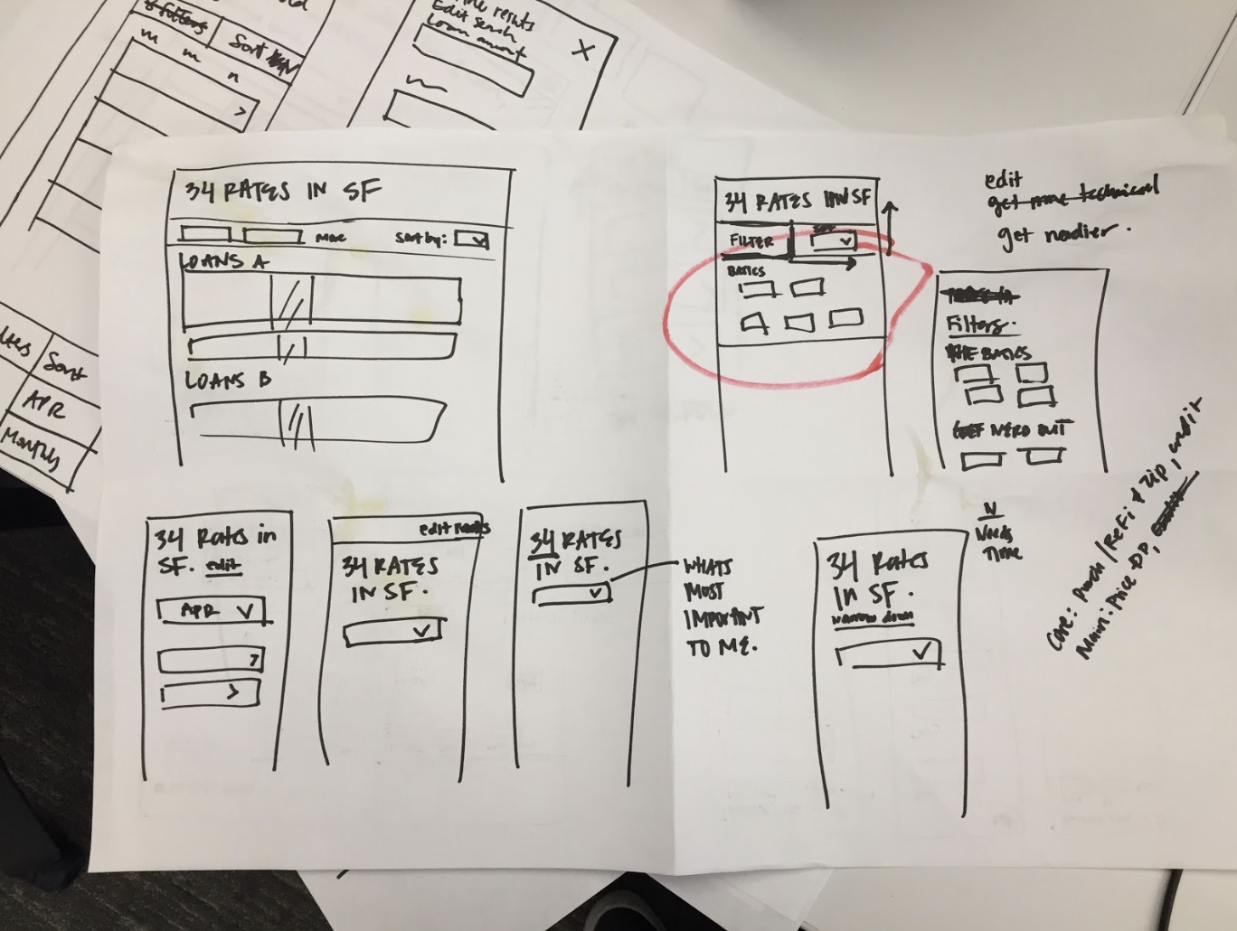
Working with a Product Manager and Product Designers from other verticals, we agreed on a plan that would entail two weeks of Research & Exploration. This phase would include competitive research, brainstorming and sketching, prototyping 3 concepts, and creating a test plan for usability testing. The following two weeks would focus on Prototyping and Design. This phase would include testing two prototypes for usability, iteration, and retesting these prototypes, sharing findings with the team, deciding on one direction, and final design.
Competitive research
I focused my competitive review on scenario planning products (shopping for a health care plan based on medical needs, travel planners, etc) to match the mindset of our users who are planning for their financial future. I also looked at how products delivered quotes, rates, and recommendations. Particularly interesting to this project were products that differentiated between personalization (based on who you are & what you need) vs customization (based on preferences). I was also important to consider consumer products outside the financial space (which isn’t known for great consumer experiences).
Themes in our findings:
• Fast, simple onboarding
• Multiple layers of search, not just one bucket of parameters (City, Price, Other, for example)
• Echoing the search in the title of the results and/or the items in the table
Key use cases
“I just want to get an idea of current market rates (little to no change)”
“I’m early on in the process of finding a [loan, credit card, or insurance] and want to see what rates look like based on my particular situation (main filter changes)”
“I’ve done my research and I’m just about ready to pull the trigger (other filters)”
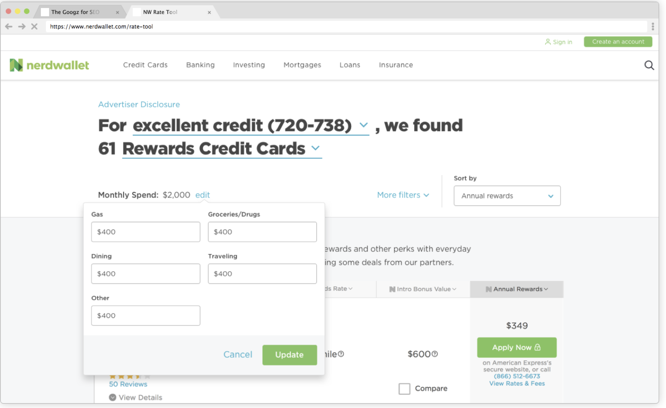
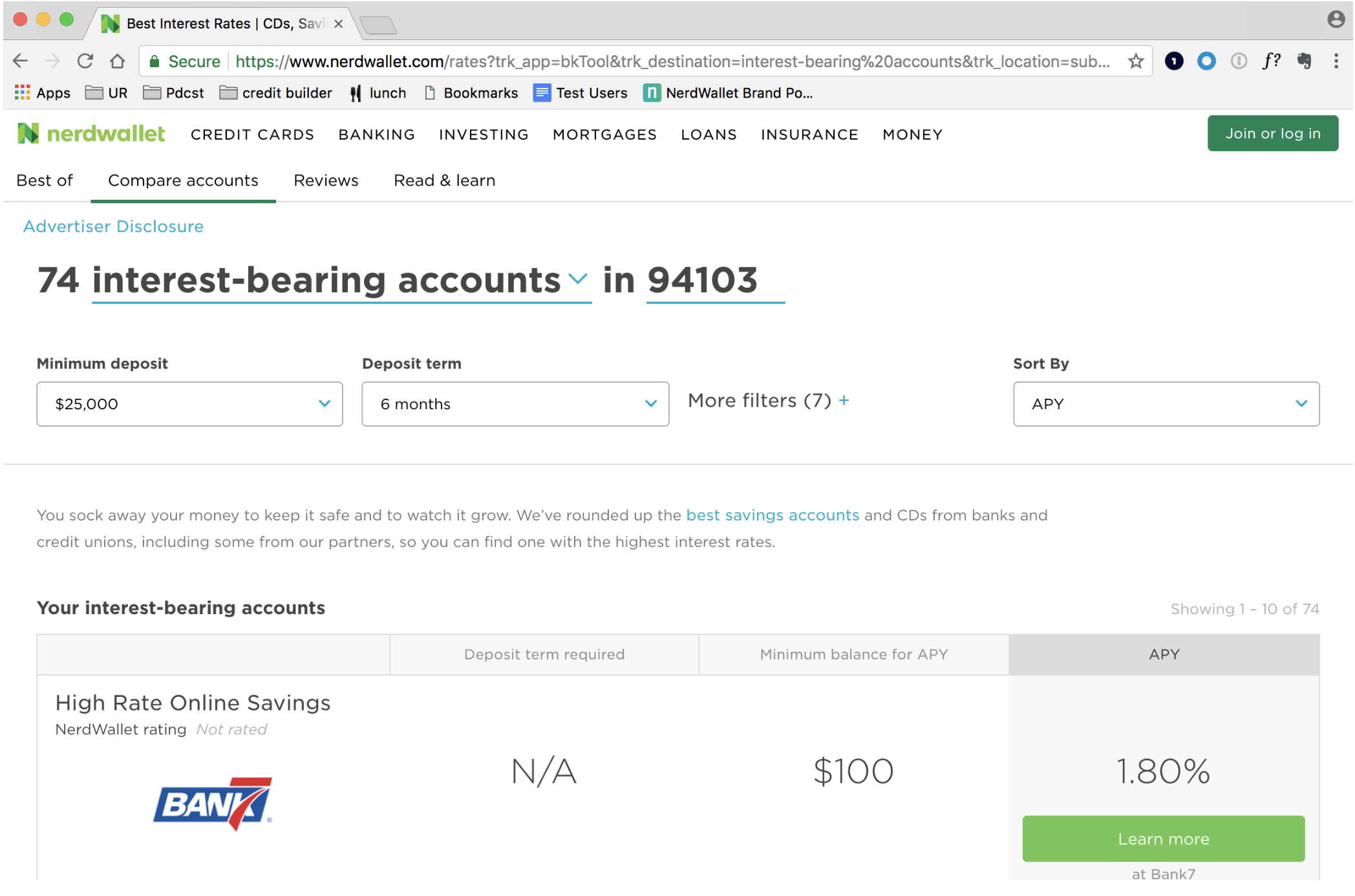
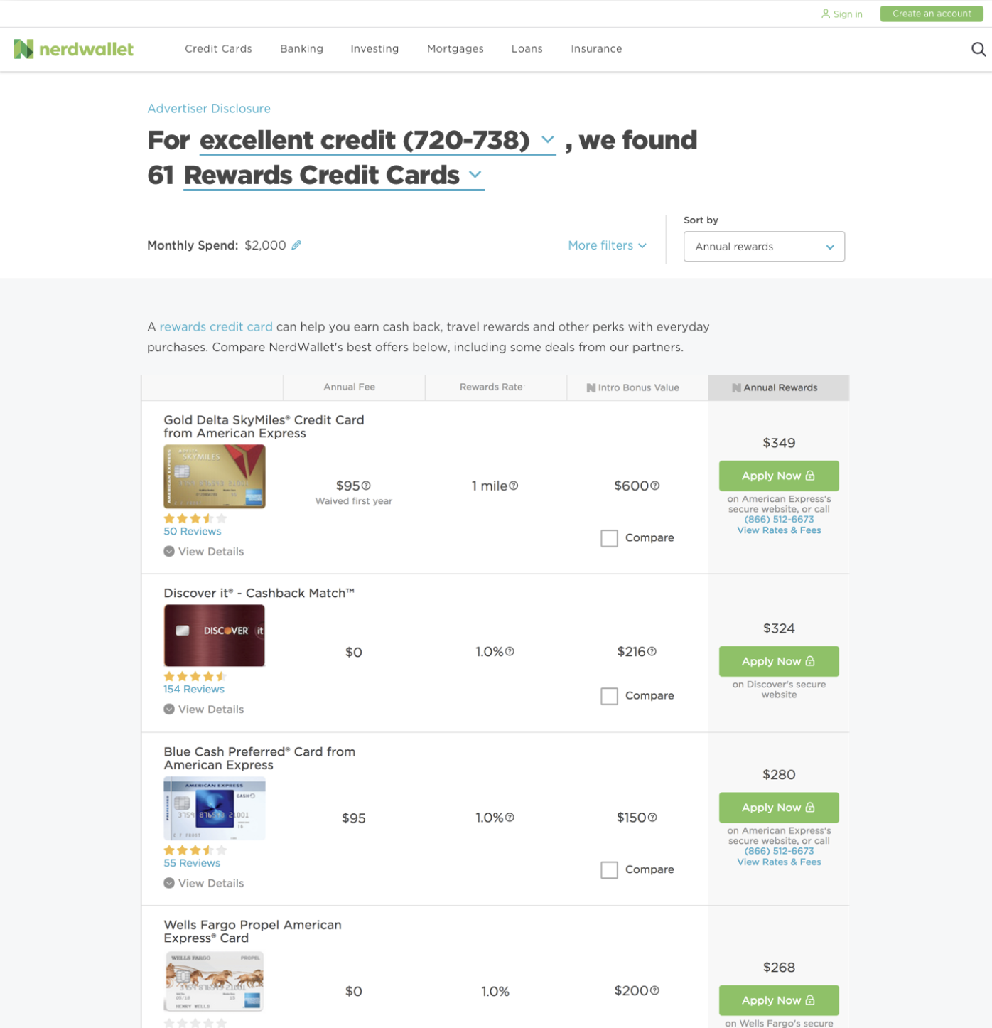
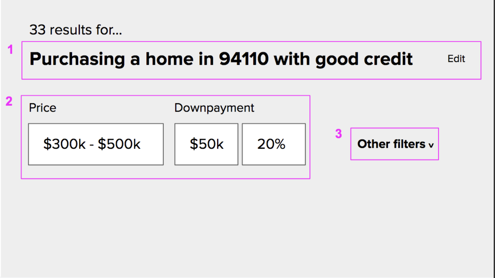
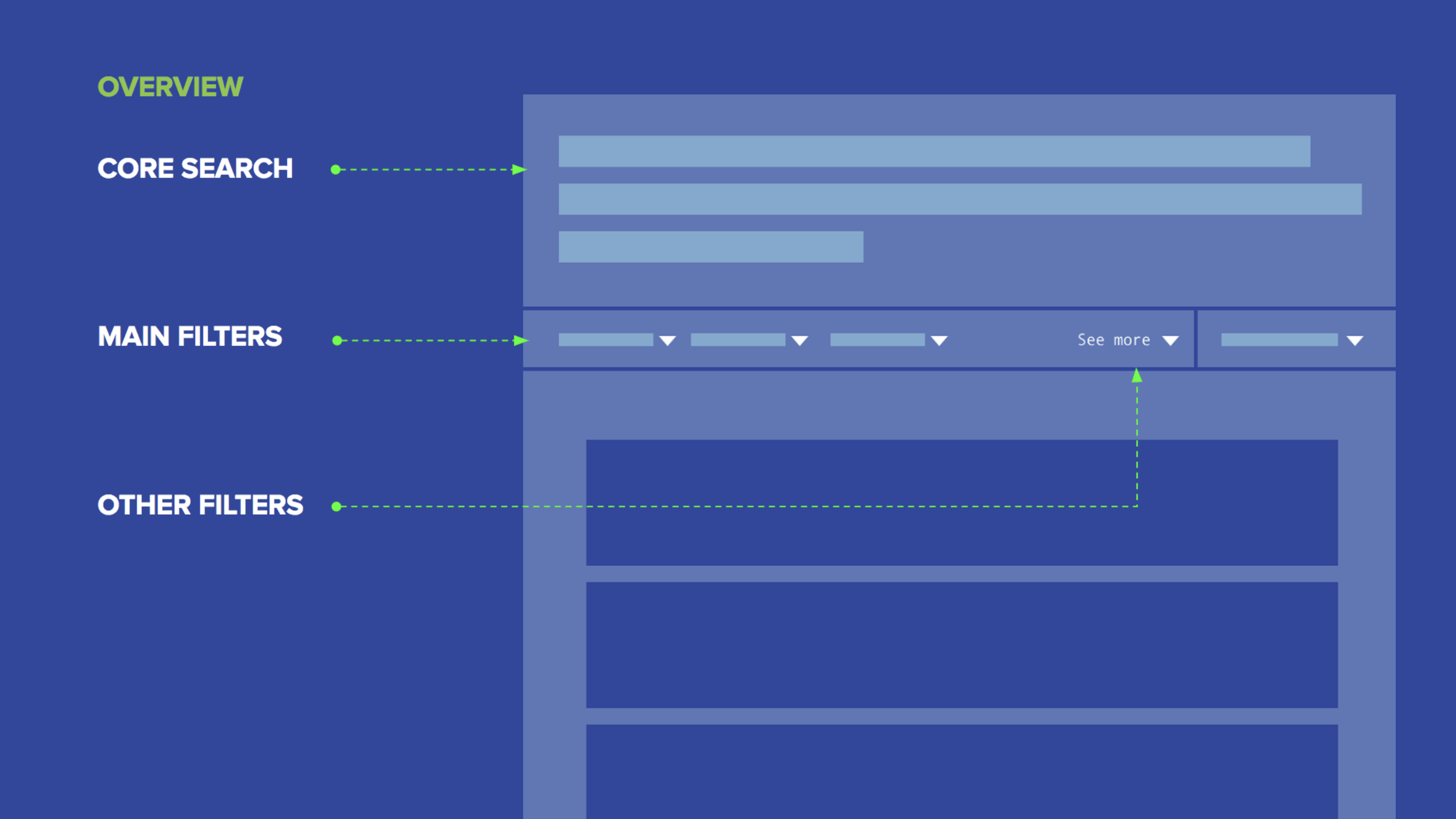
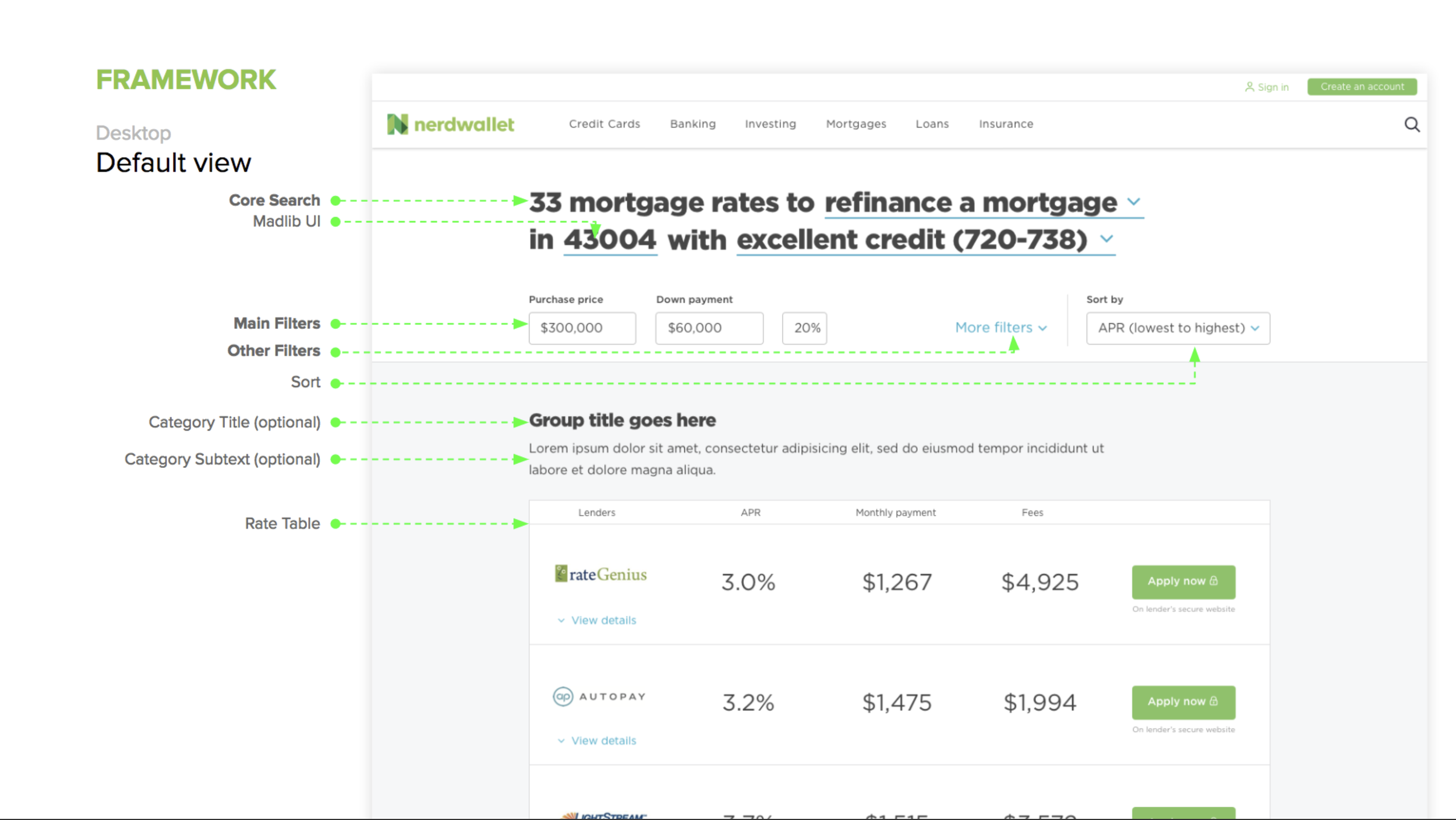
Establishing a new mental model
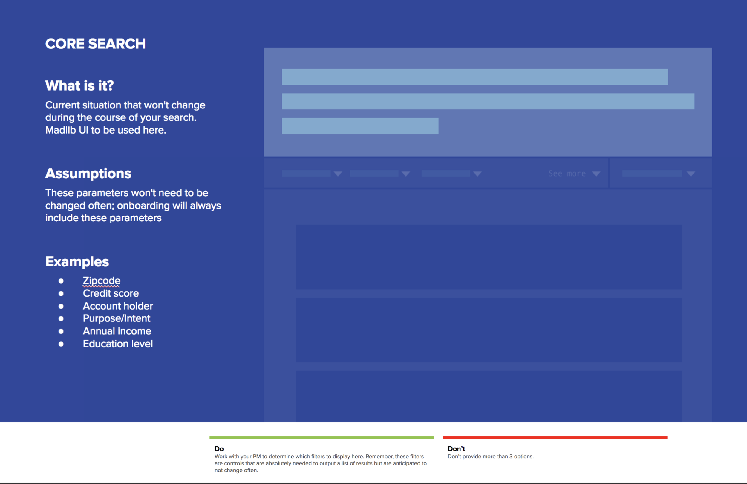
1. Core search: Part of the user’s current situation and likely won’t change during the course of the search; a summary
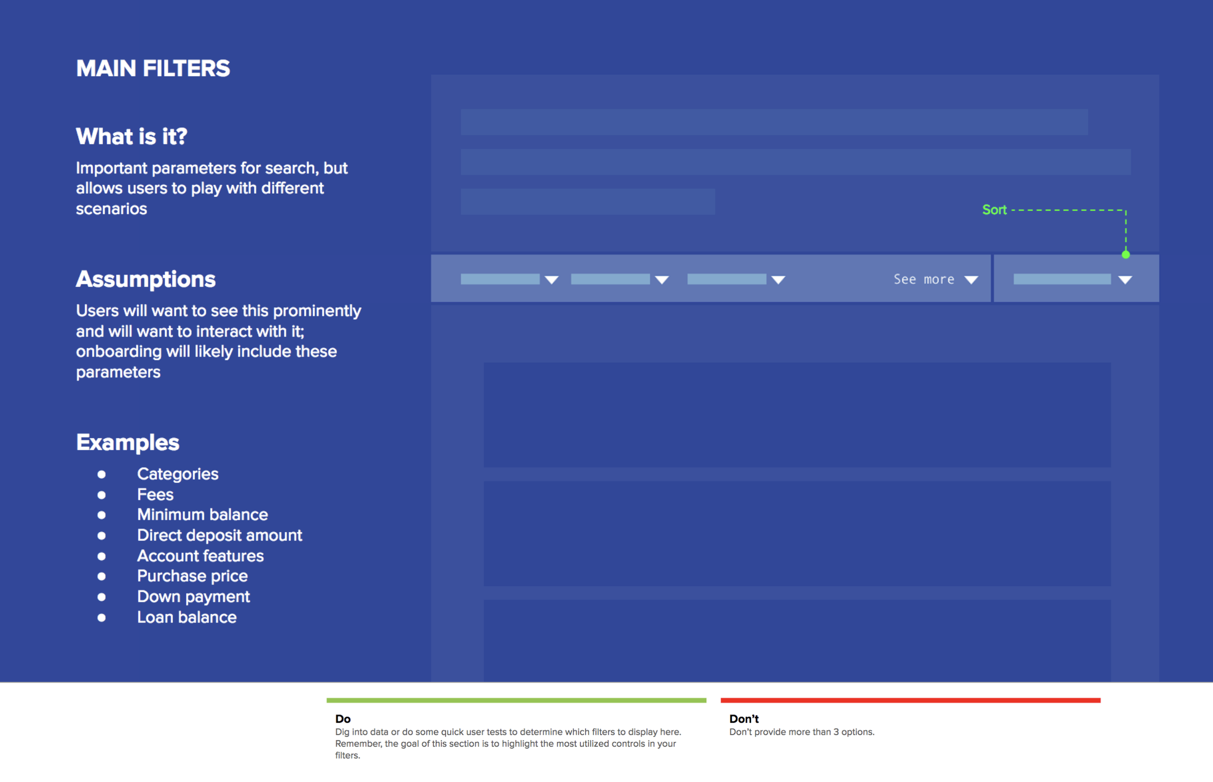
2. Main filters: Important parts of the search that the user may want to explore for different scenarios
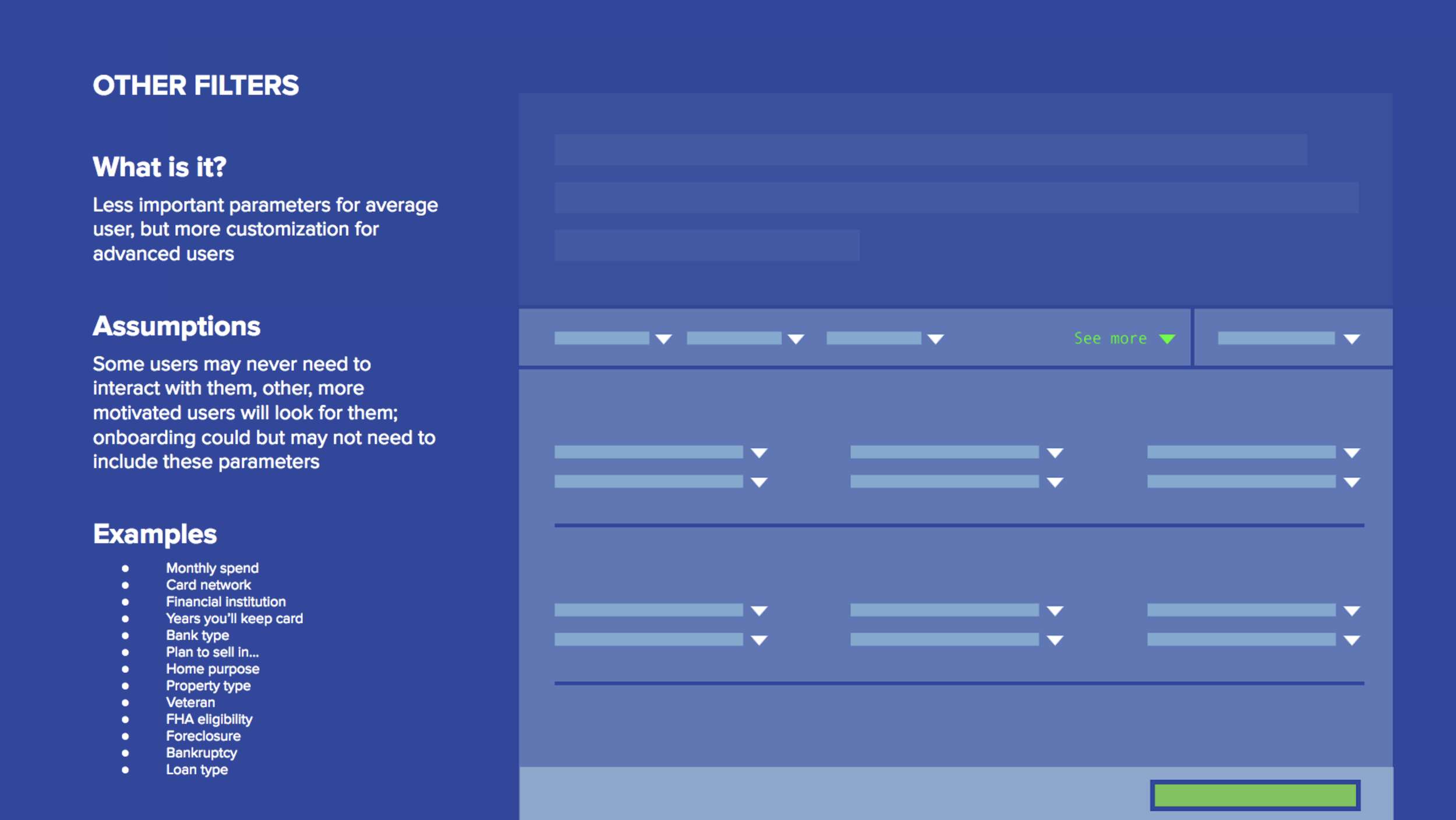
3. Other filters: Less important or more advanced parameters of search
Key Ideas
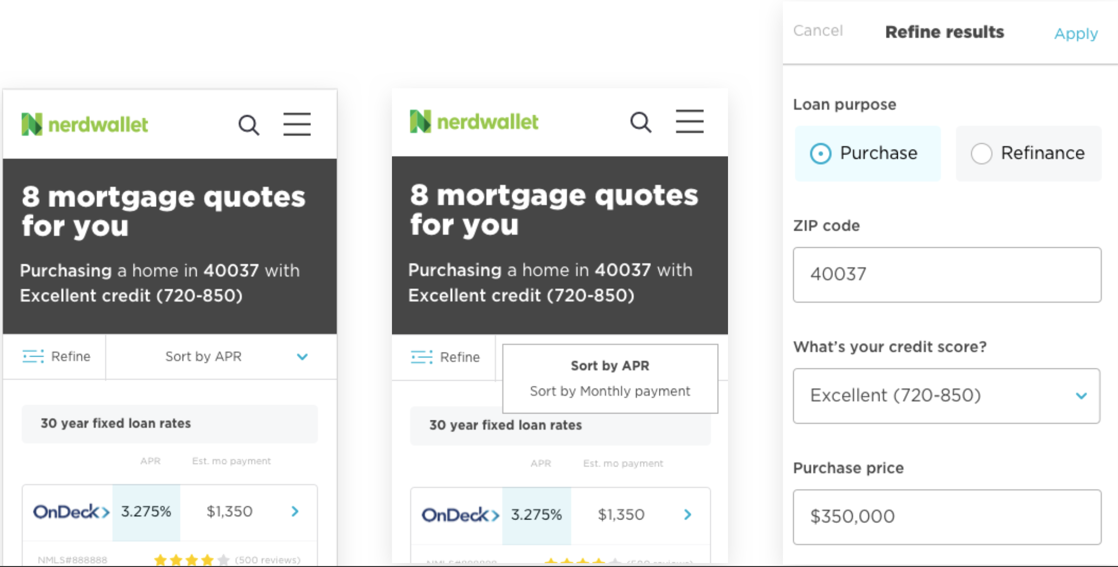
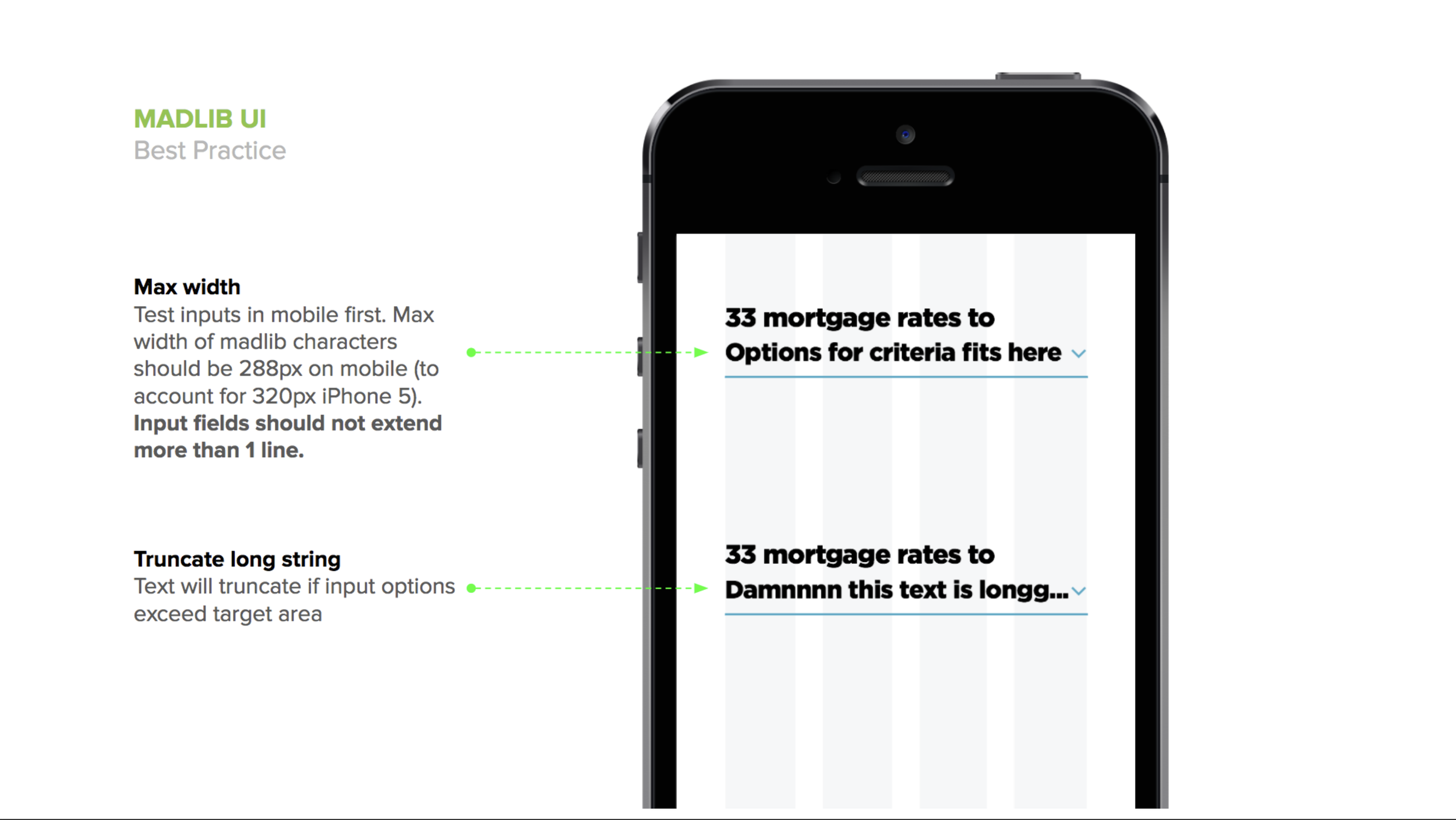
Mobile behavior
Core, main, and other are still staples of filter organization, but in mobile, they all live together in an all filter bucket in order to surface the most important information (rates) quickly.
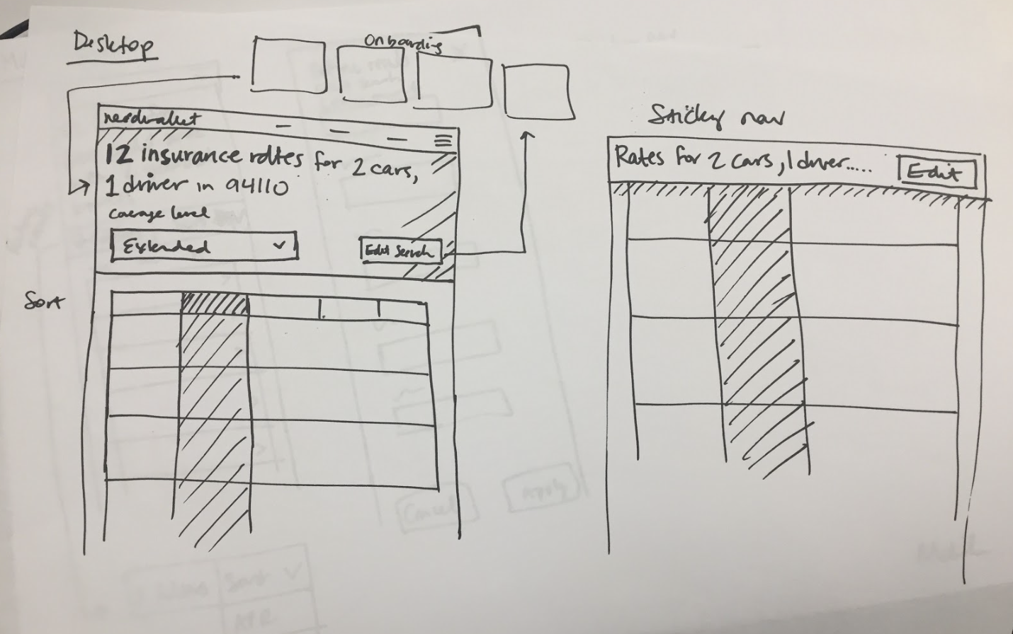
Sticky header
Sticky header with easy-to-access button to edit search (or see all filters). This should help make editing more discoverable.
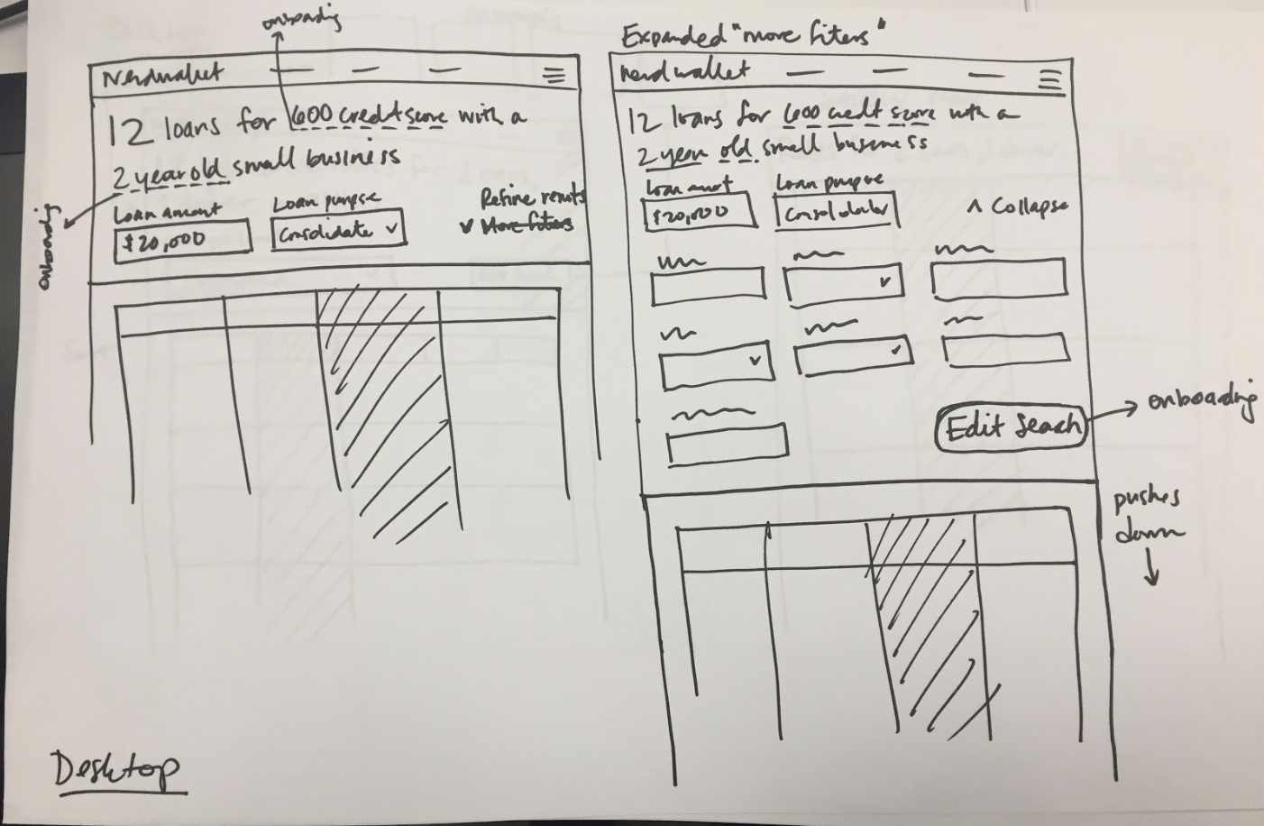
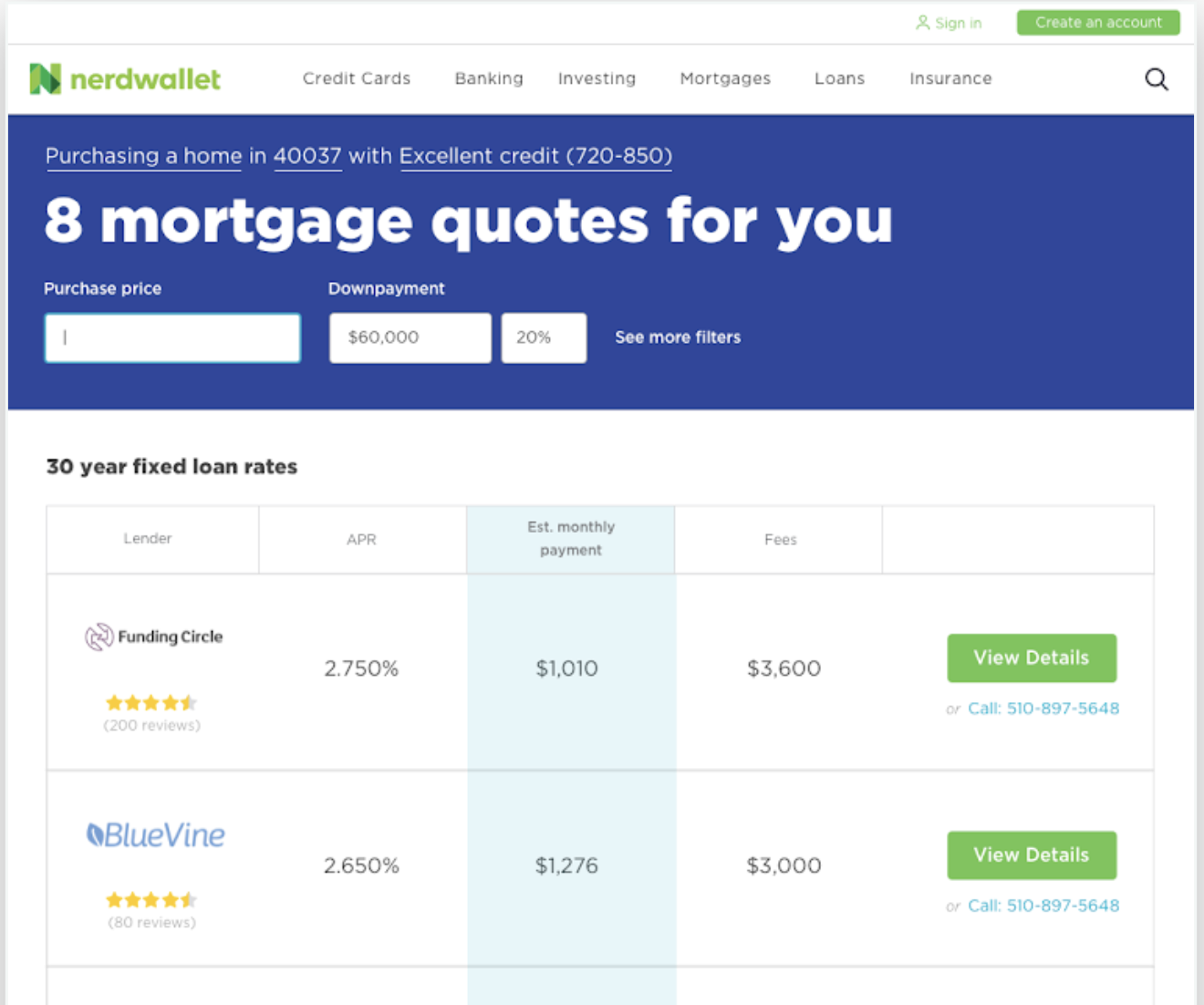
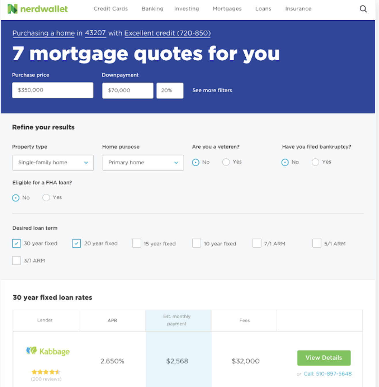
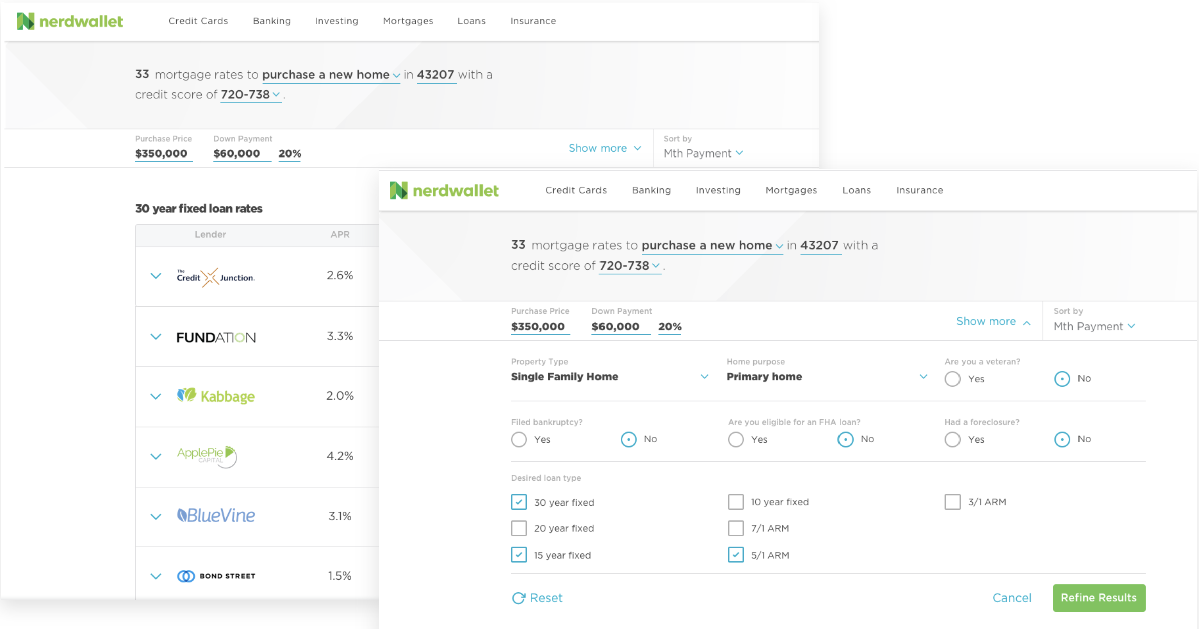
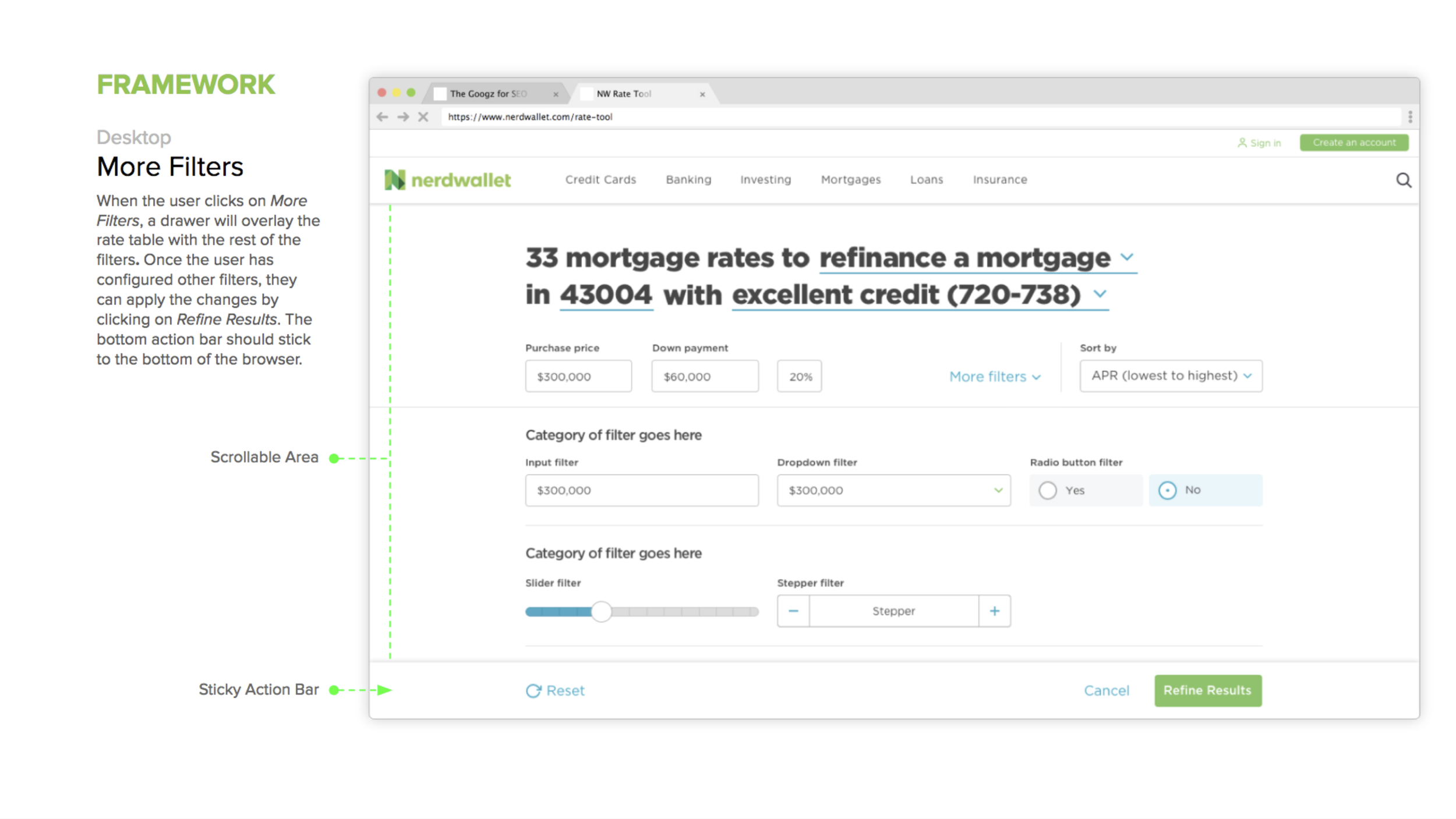
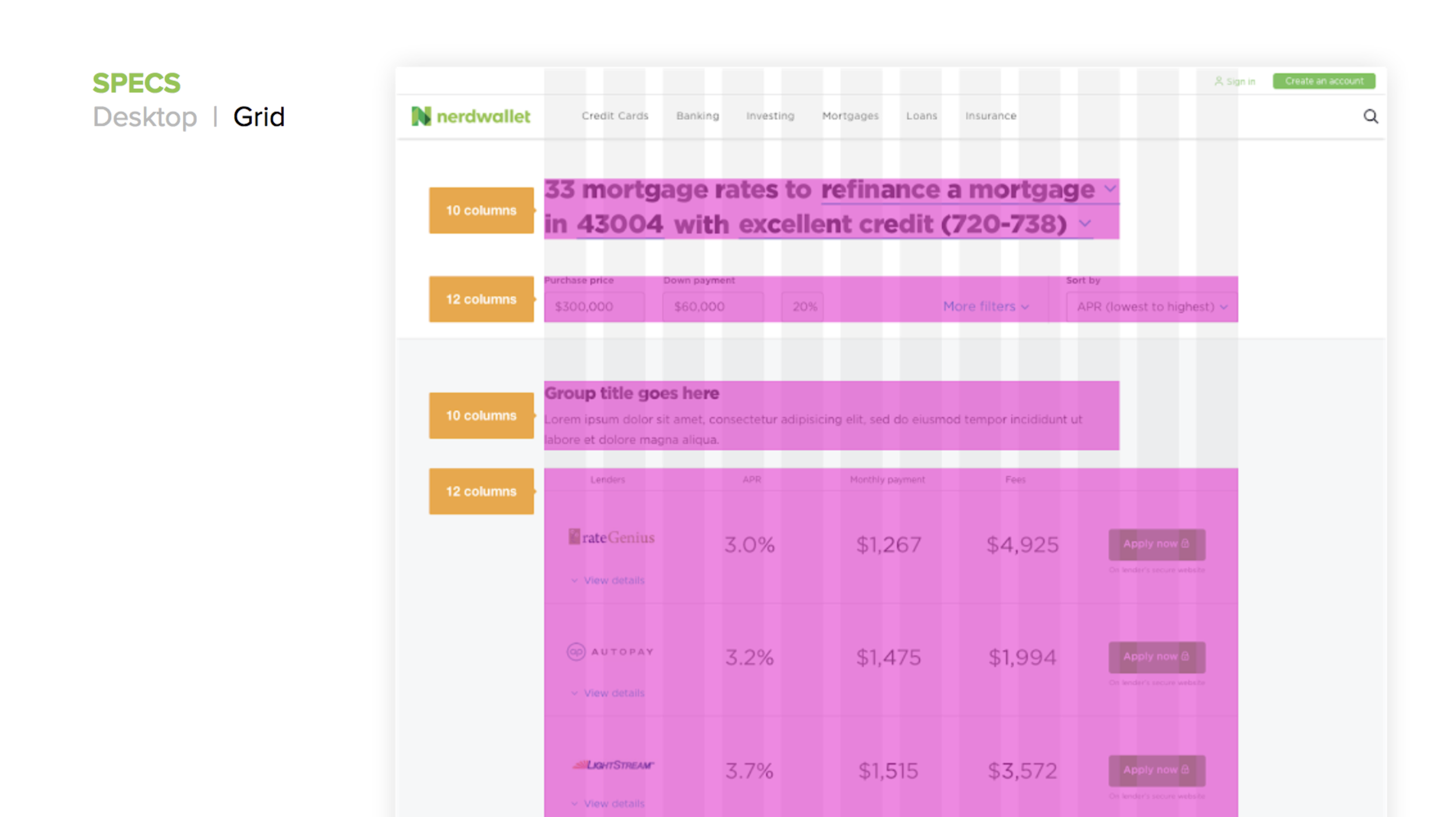
Desktop expandable page header
The page header echoes the core search and displays the main filters. When the user wants to see more filters, the page header expands down, pushing down the table.
Usability testing
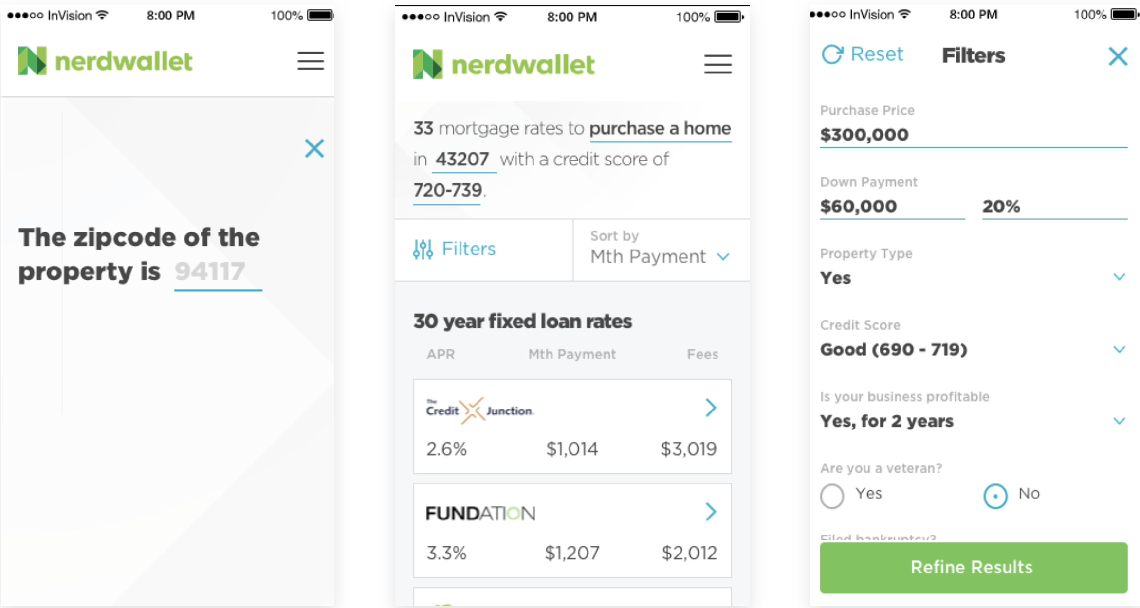
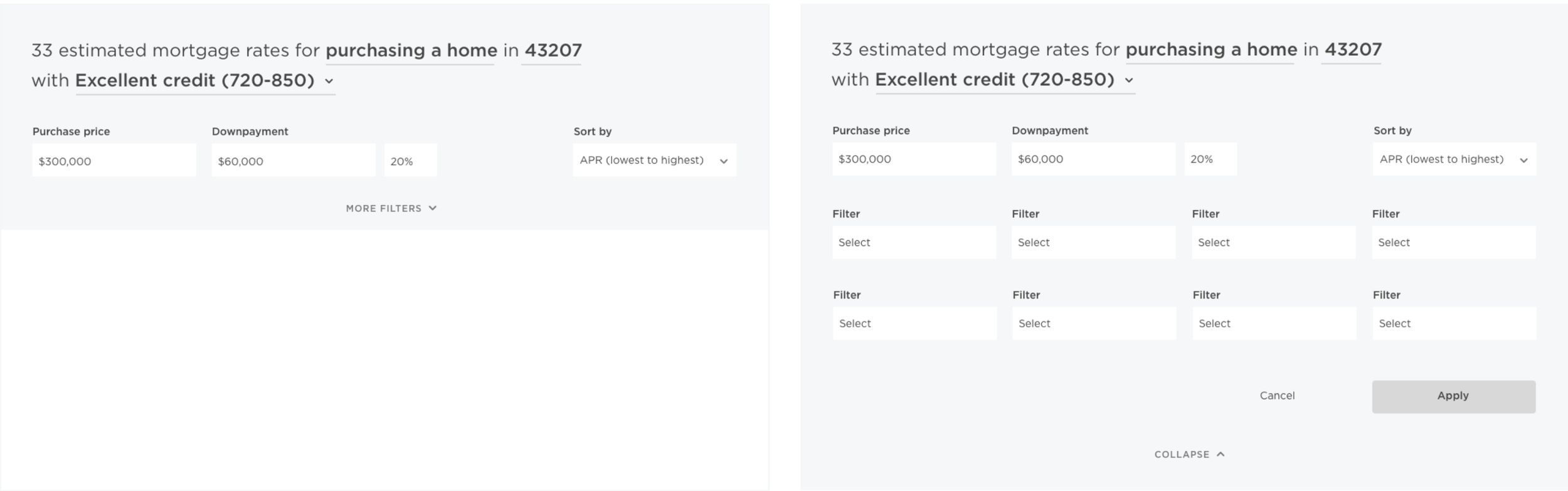
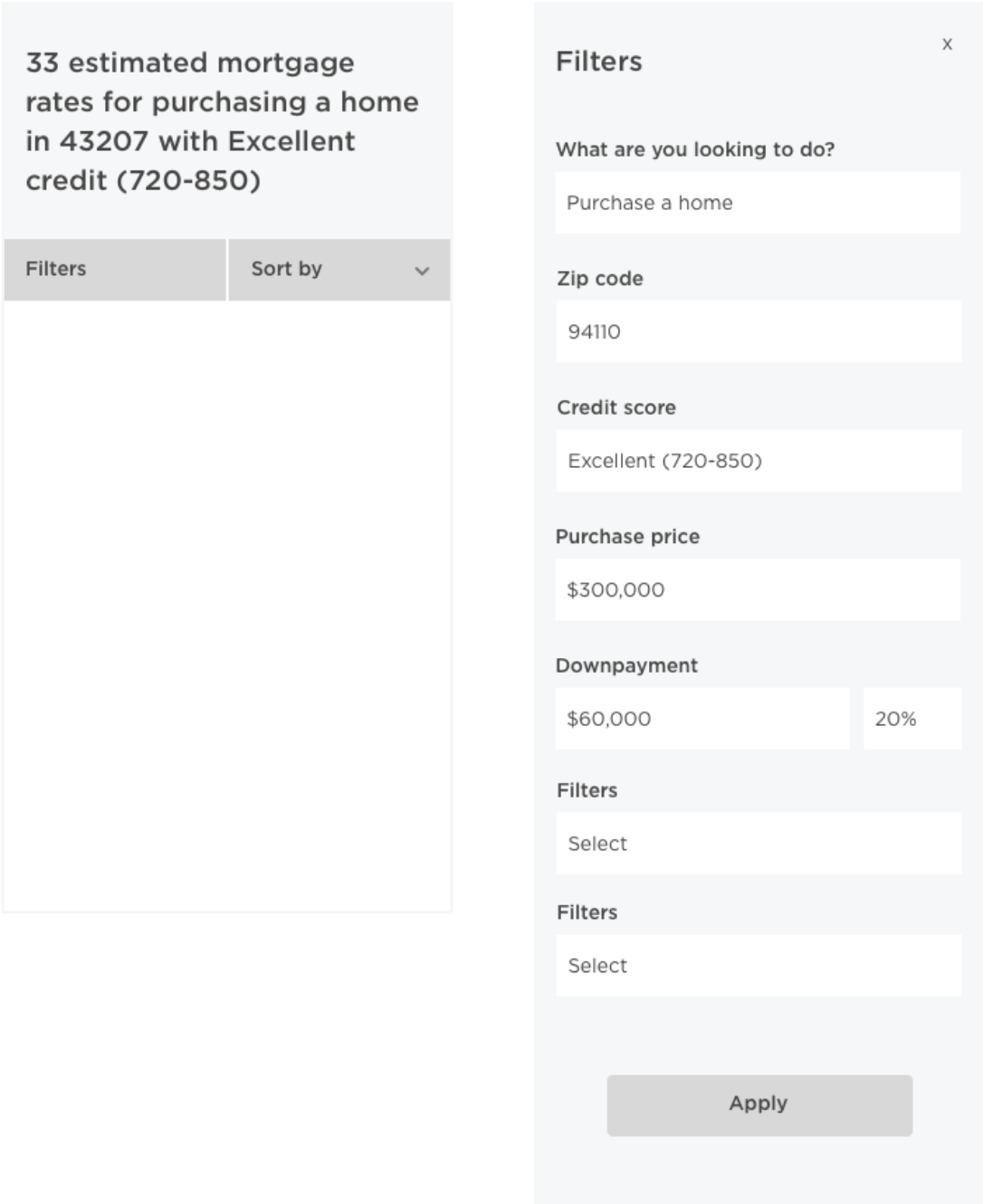
In the testing phase, our main goal was to gather insight on the usability & discoverability of desktop & mobile filters by designing remote task-oriented sessions utilizing usertesting.com. I designed two scenario, task-oriented tests for the two mobile and two desktop designs shown below and tested with 12 users.
Desktop solution 01
Mobile solution 01
Desktop solution 02
Mobile solution 02
Takeaways & guiding principles
Overall patterns (core, main, more) worked without issue
The dropdown line UI element was confusing and unclear in its purpose. Explore more explicit affordances.
Met conventional expectations
Users prefer “apply” buttons for confirmation when using filters
On desktop, users expect “sort” to be called out explicitly in the header area
“Filters” may be clearer than “Refine” as the initial label
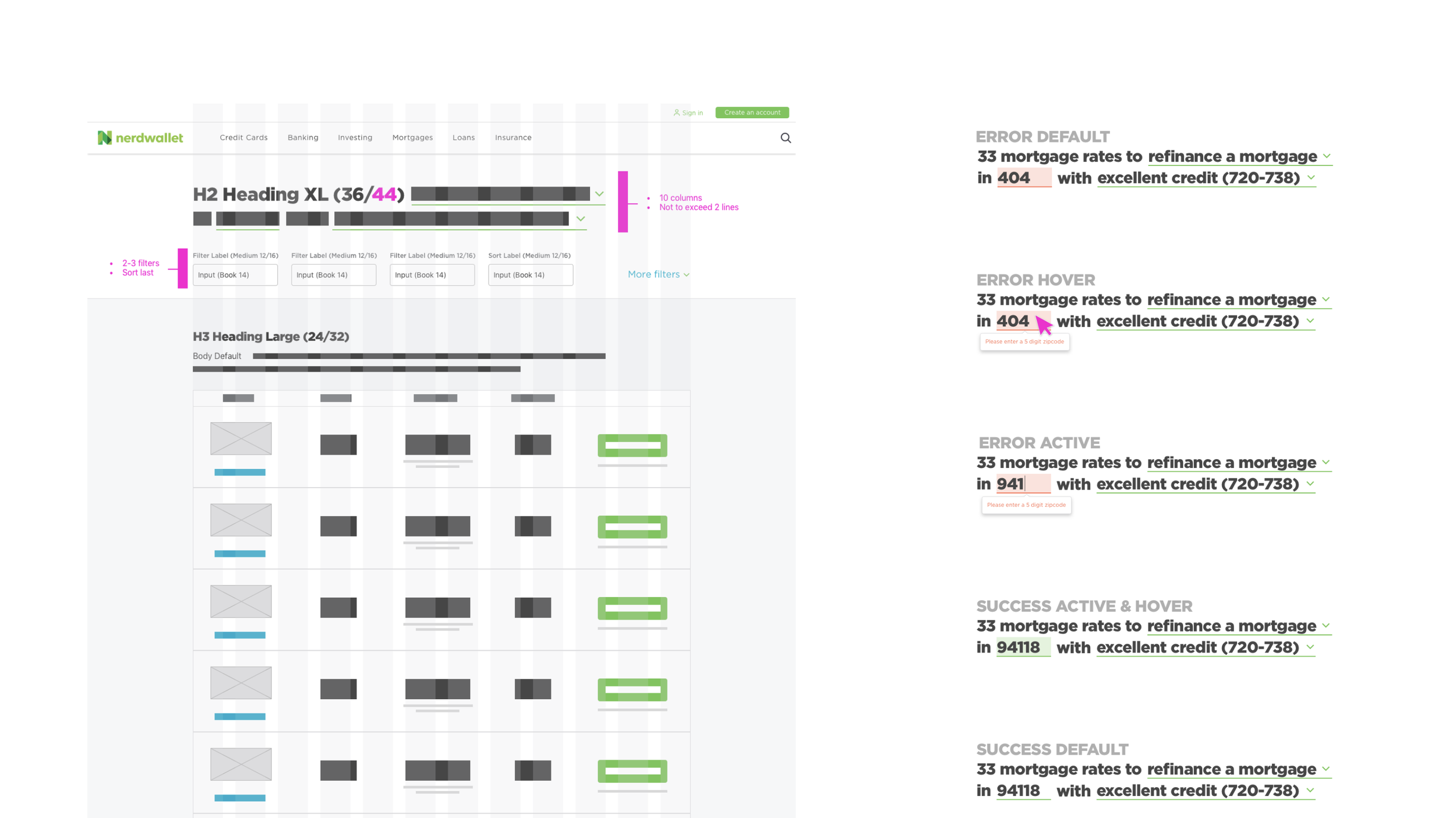
Speak in human terms: Users recognize city names, not zip codes
Give clear feedback when results are sorted (animation, colored columns, etc)
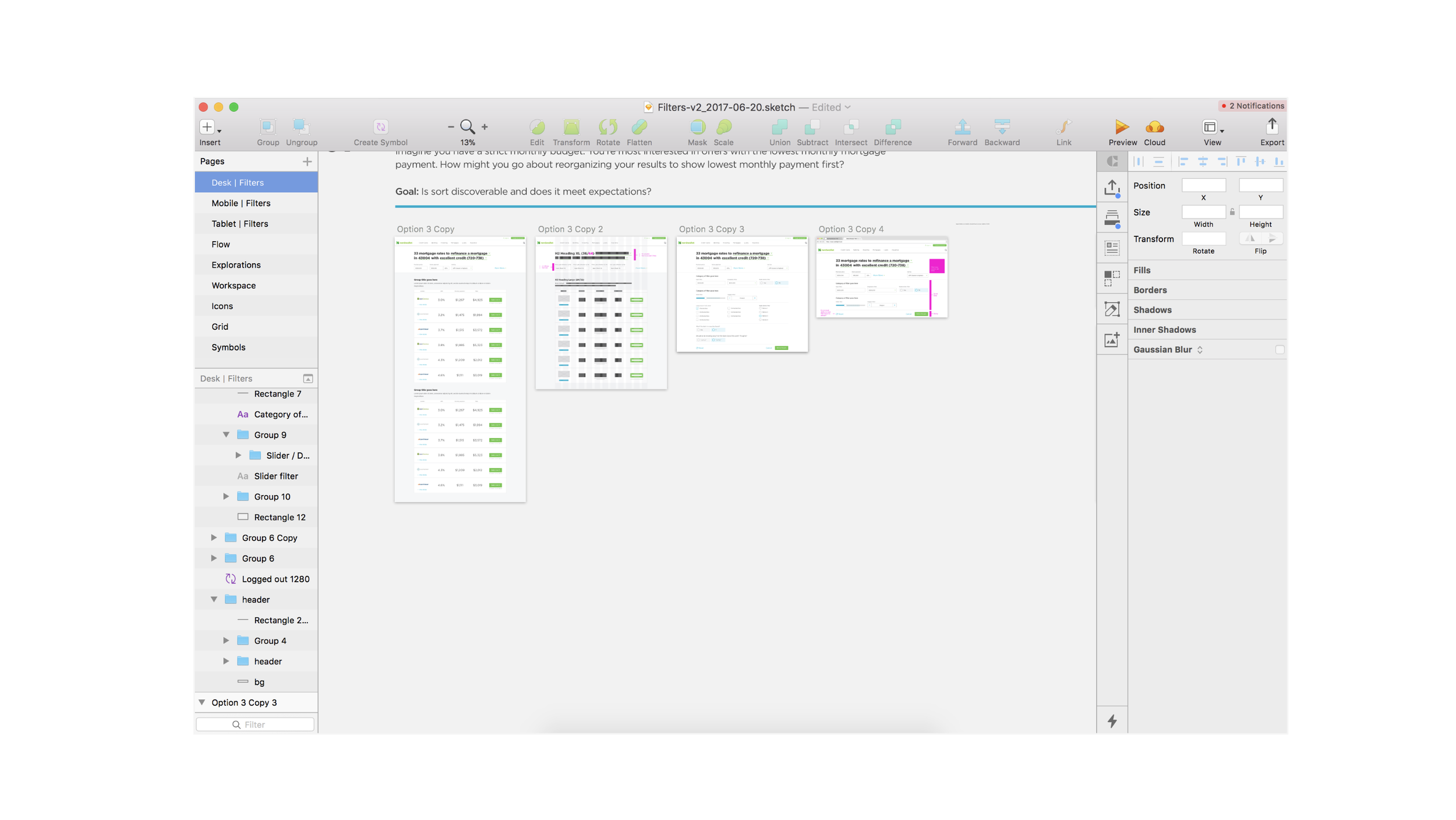
Final wireframes & visual design
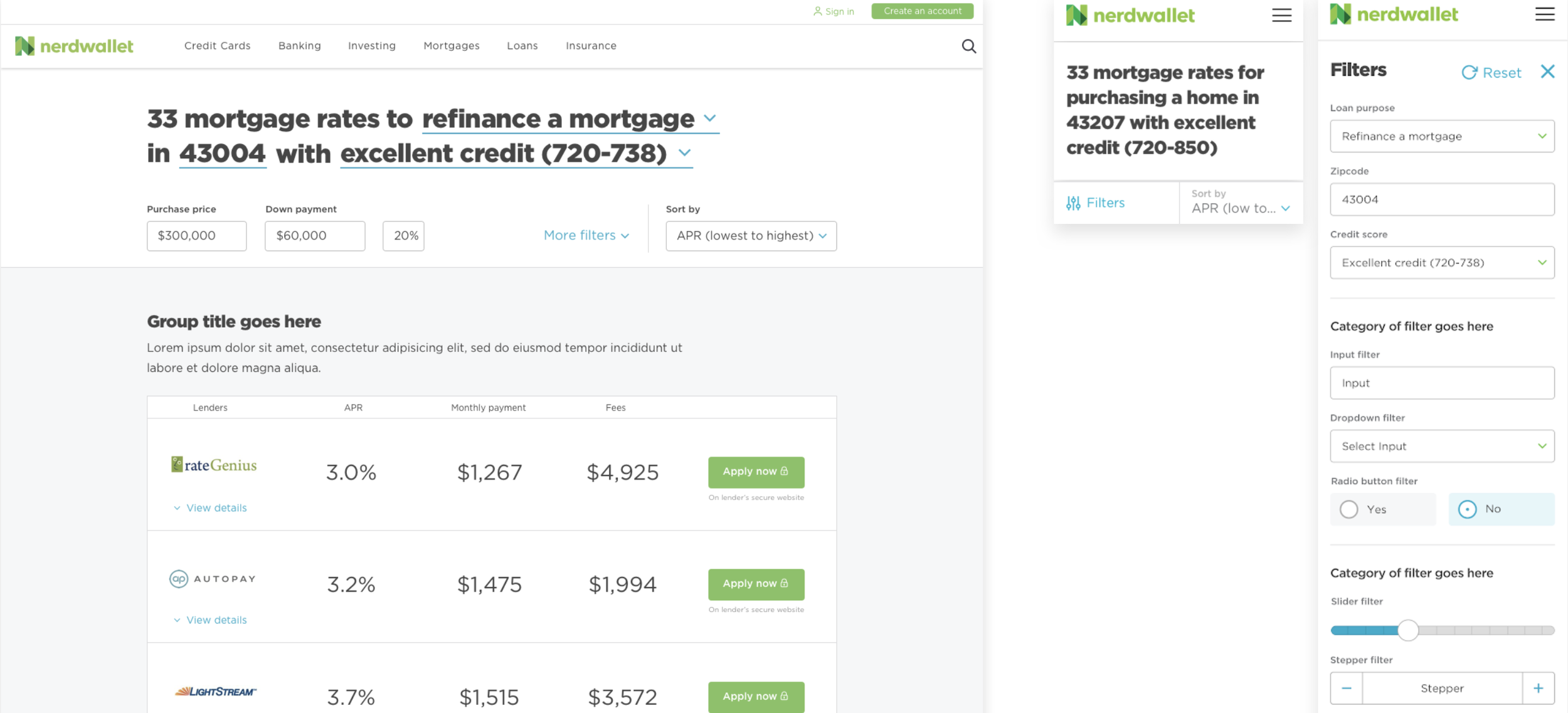
Styleguides & resources for teams
The following Style Guide was created as a resource for the component library team (designers and engineers) to implement the components across Nerdwallet’s desktop and mobile experience. This Style Guide was also used in stakeholder conversations to share/advocate for the wide use of the component and adherence to tested and defined systems.
Adoption & results
For the filter component to get adopted by the verticals (mortgage, insurance, small business, and banking), this redesign needed to break even or improve on filter engagement rates. After measuring engagement rates before and after implementation, the team saw no to minimal change in most verticals and 8% increase in engagement on the Banking vertical desktop experience, and so the design was implemented across all verticals.